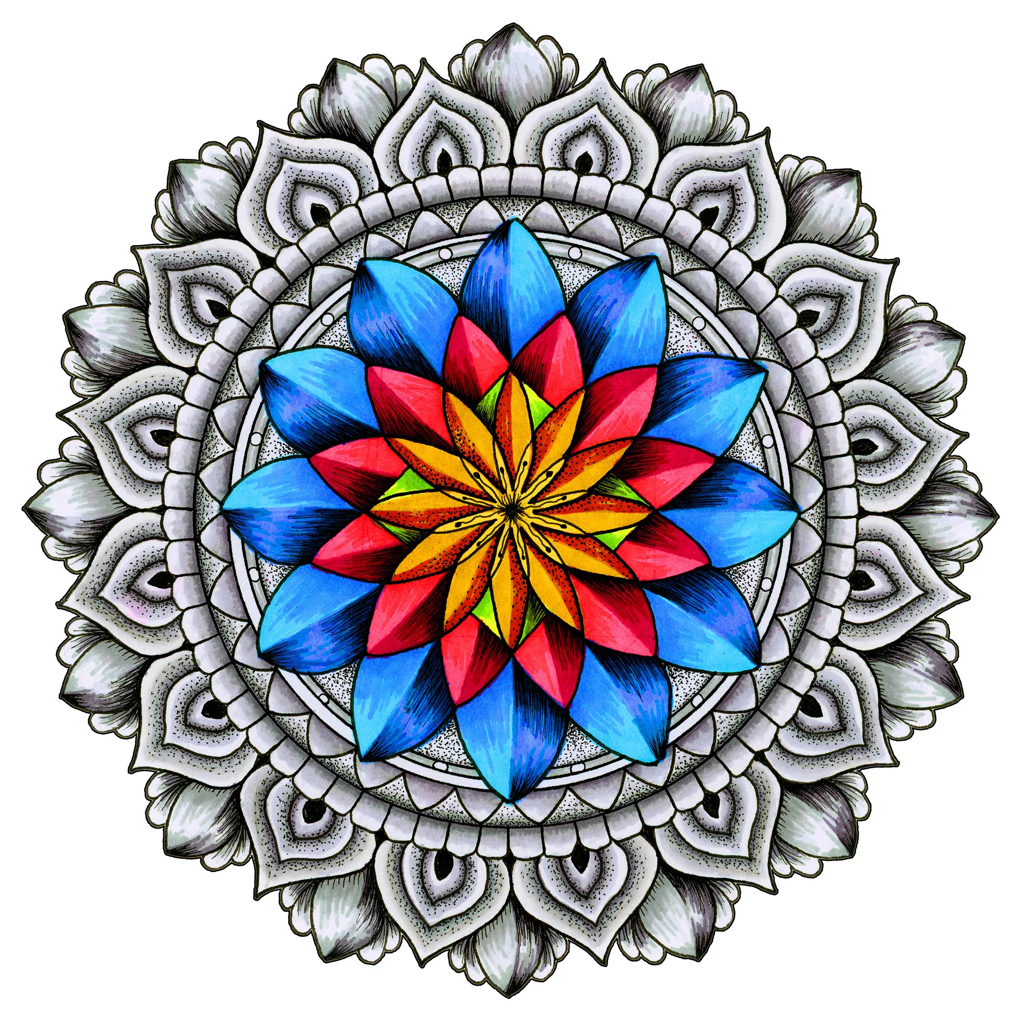
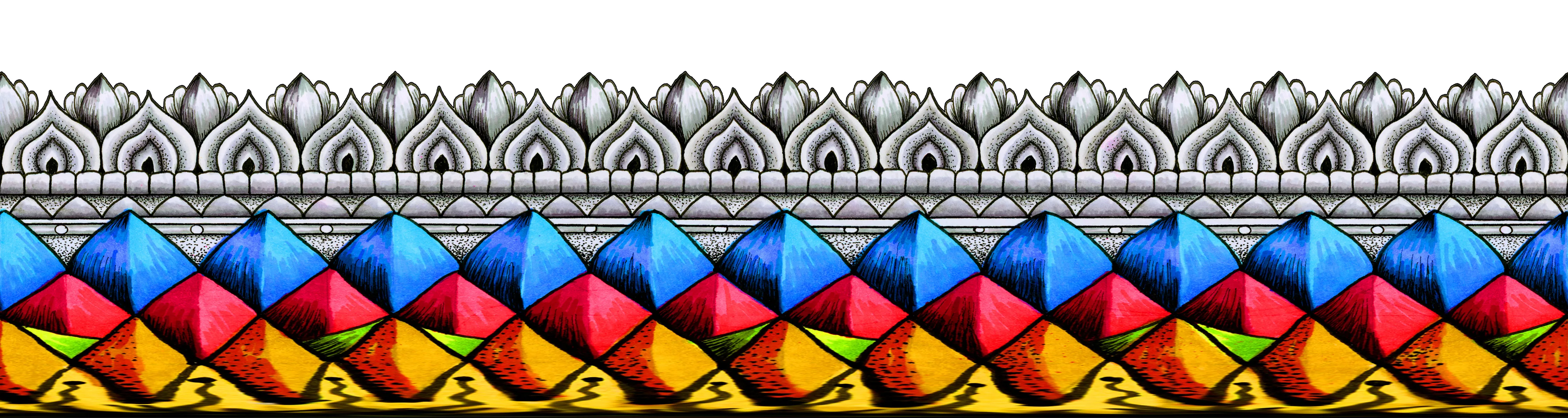




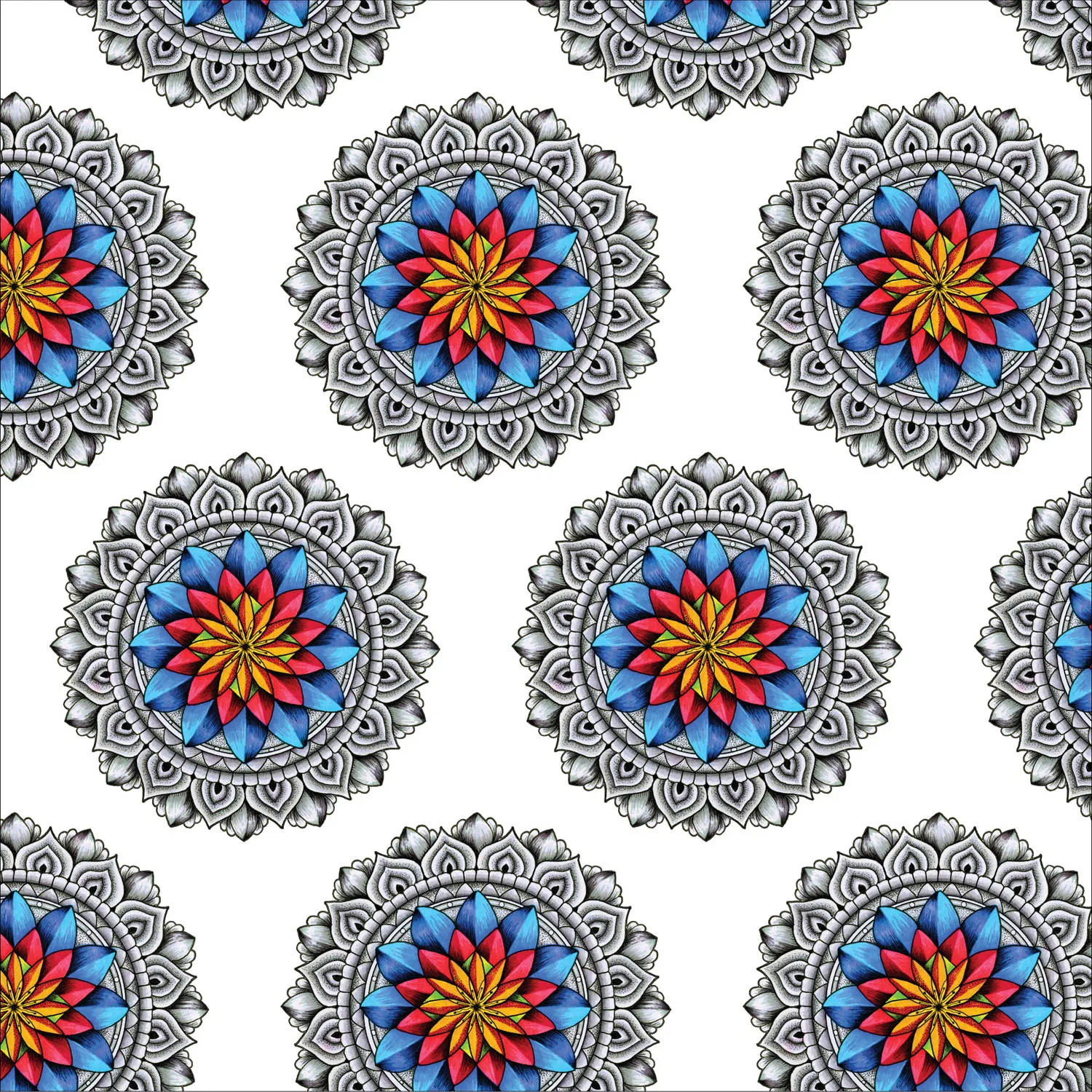
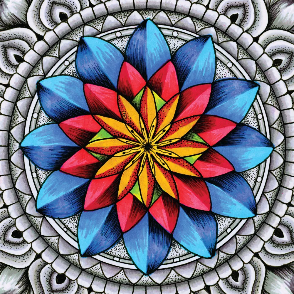
Inner Coherence is built on contrast.
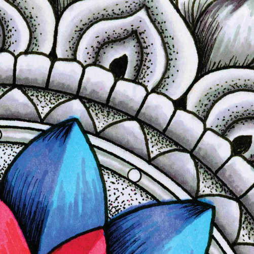
A structured grayscale outer mandala establishes stability and architectural balance, while the center erupts in layered color: saturated blues, reds, yellows, and greens forming a radiant geometric bloom. The result is a design that draws the eye inward before expanding outward in controlled symmetry.
The monochrome exterior creates grounding and scalability. The vibrant core provides emotional energy and immediate product presence. Together, they create a balanced tension between restraint and expression — structure and vitality.
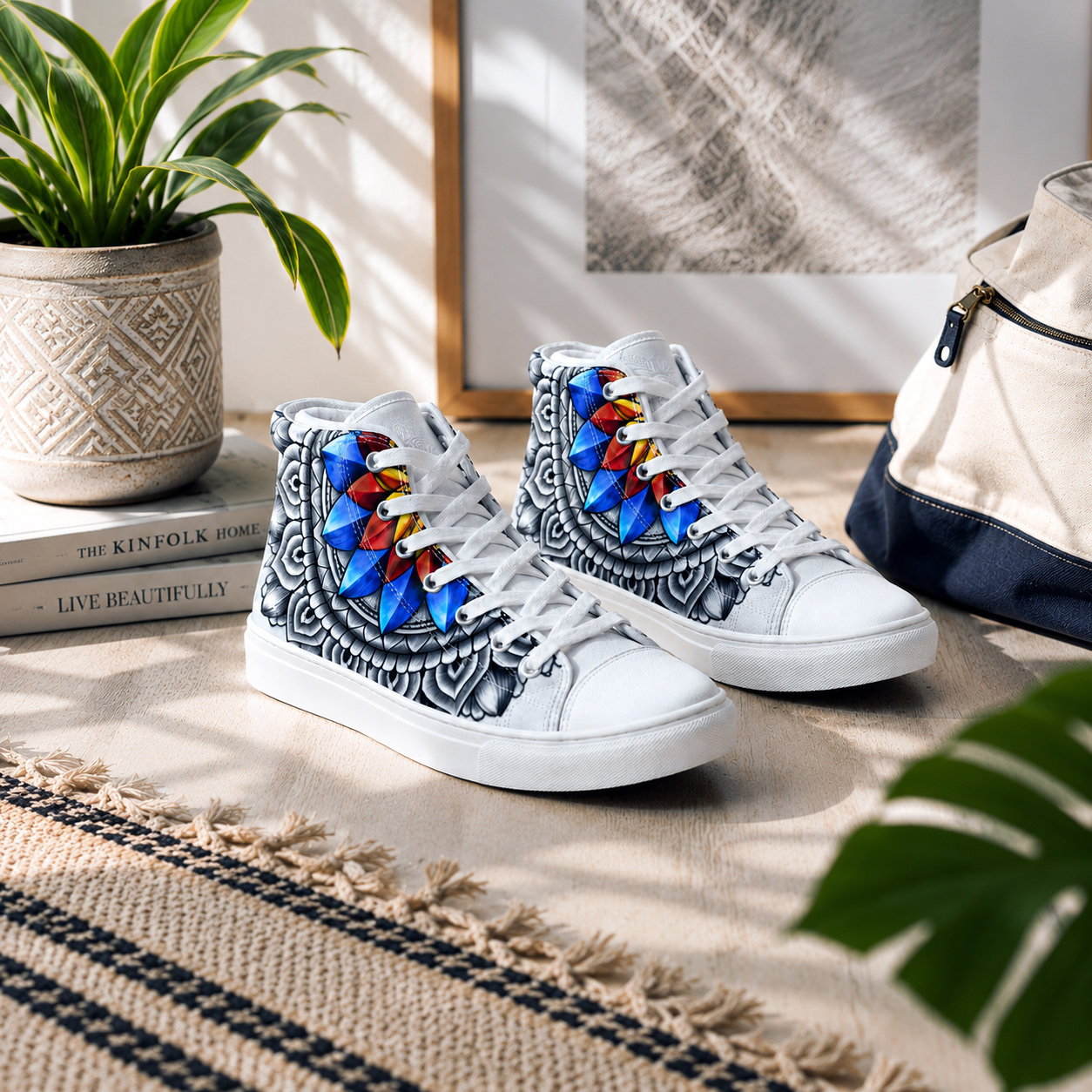
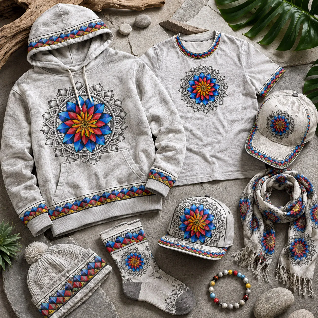
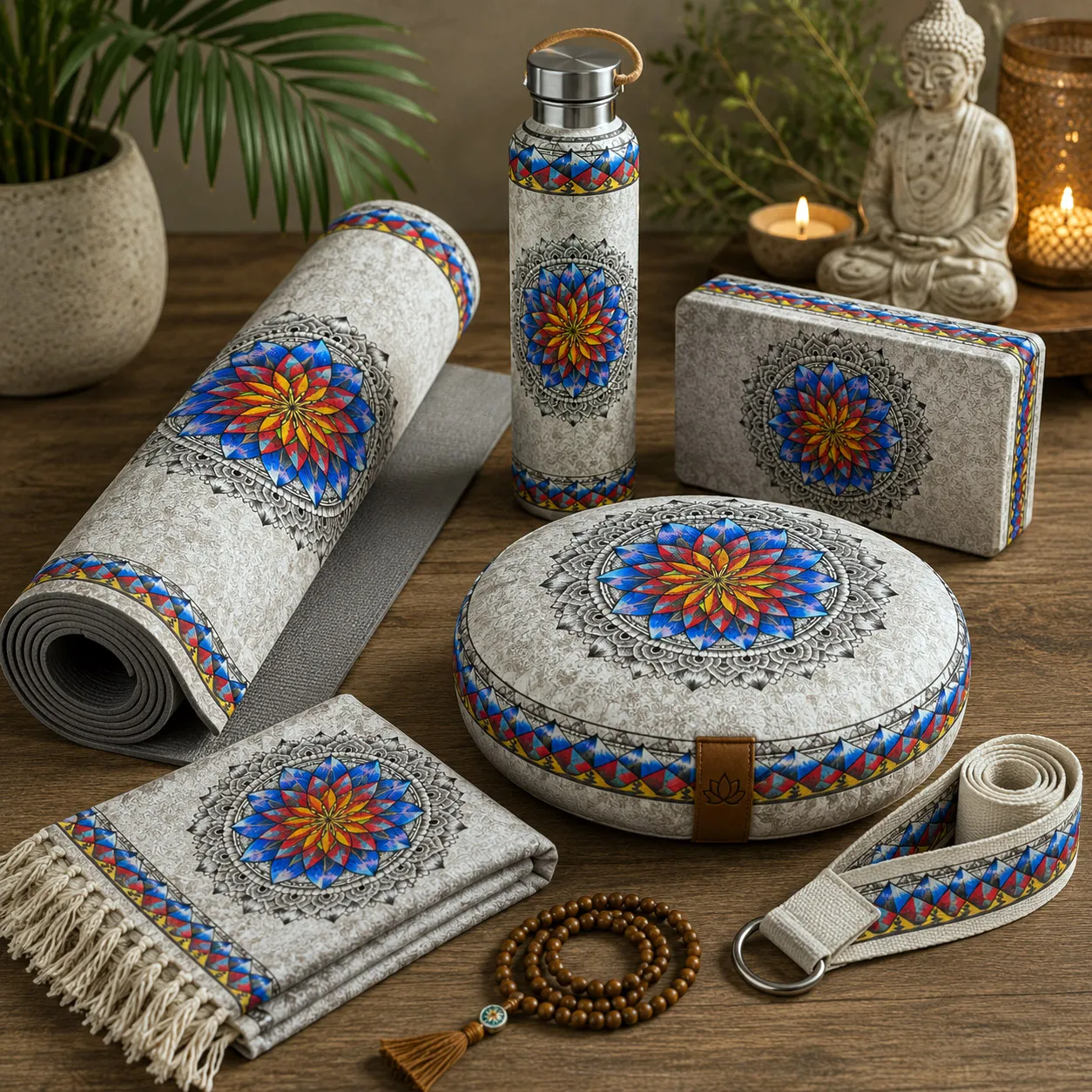
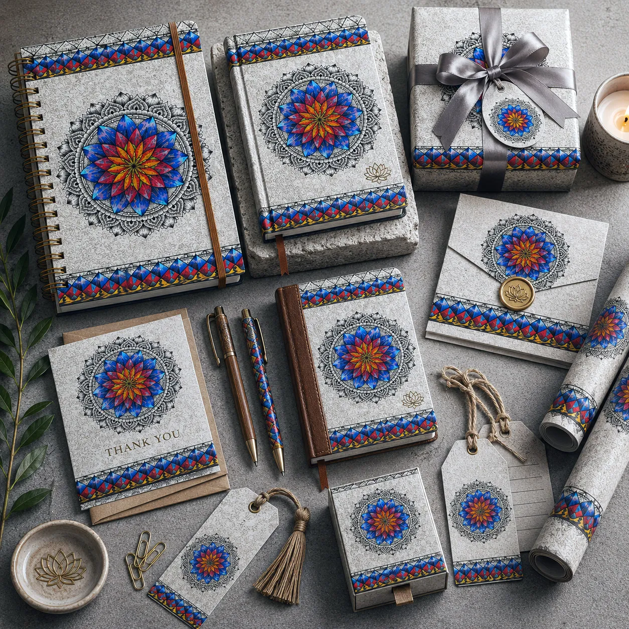
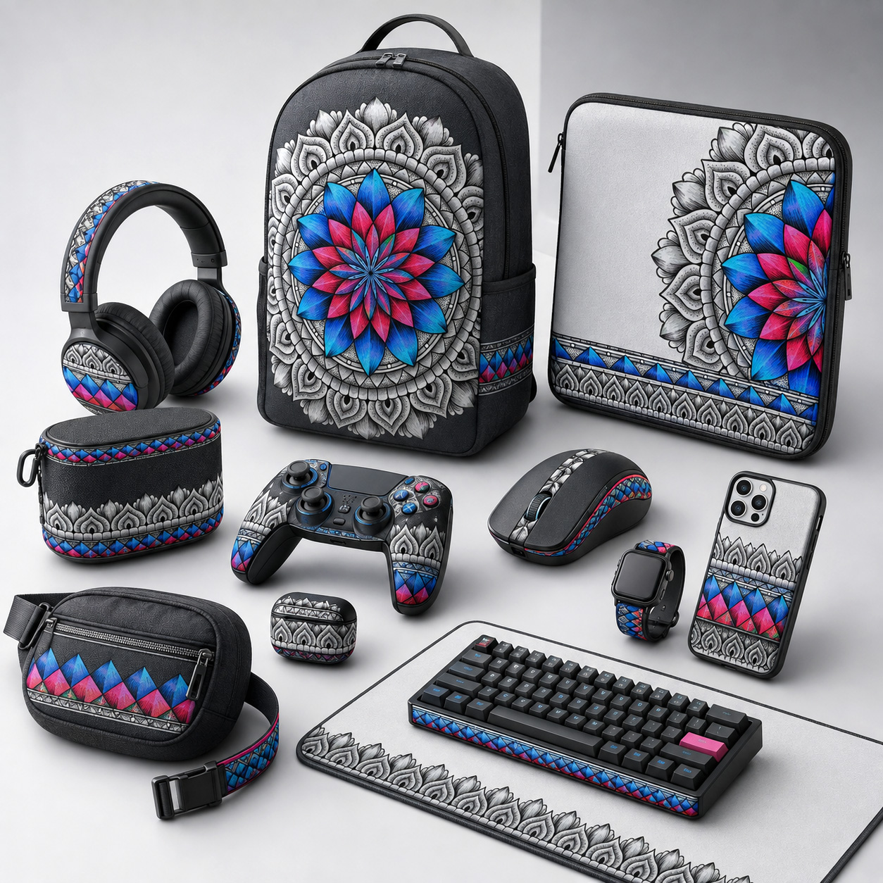
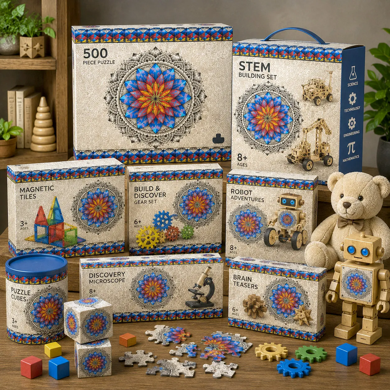
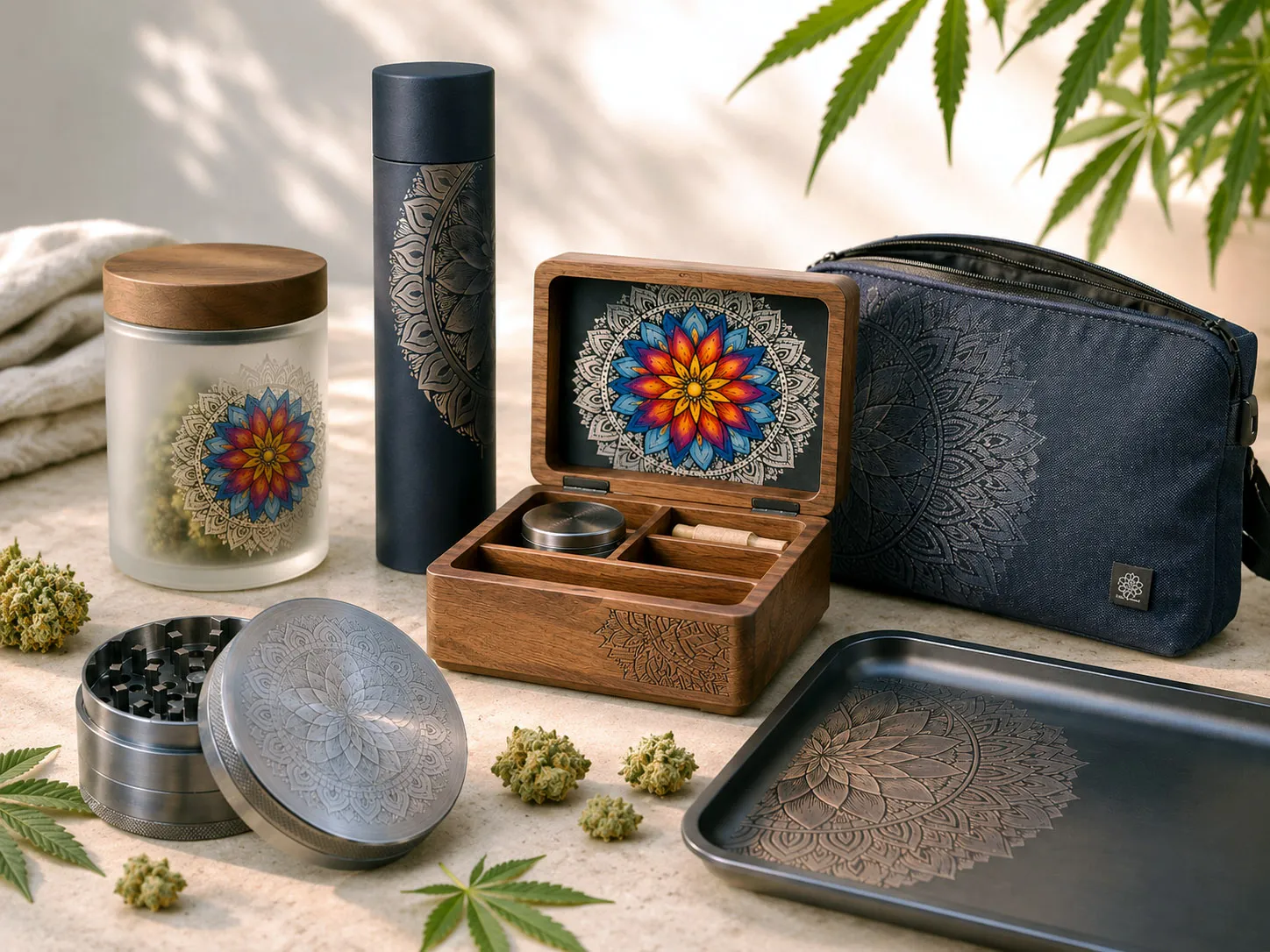
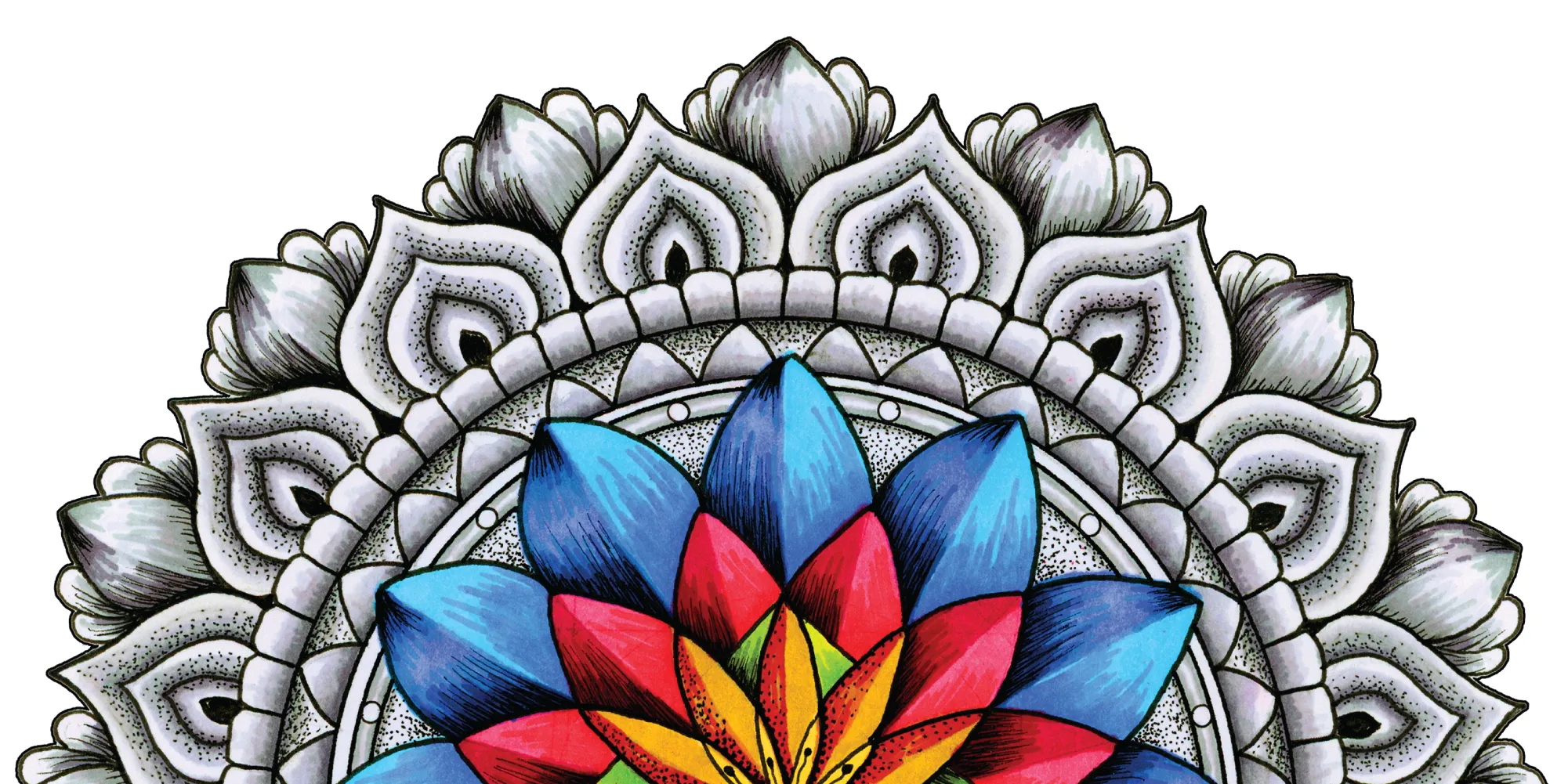
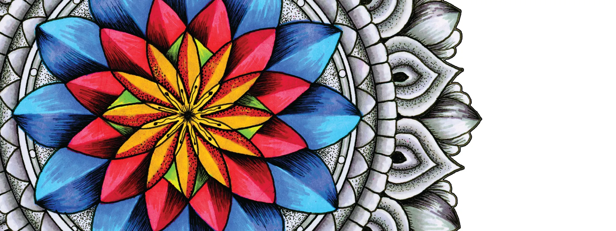
This system performs exceptionally well across product categories where focal impact matters: footwear medallions, apparel center placements, yoga mats, beach towels, statement textiles, and packaging. The central bloom can also be isolated, recolored, or expanded into repeat systems while maintaining structural integrity.
Inner Coherence represents alignment — when structure and energy work in harmony.
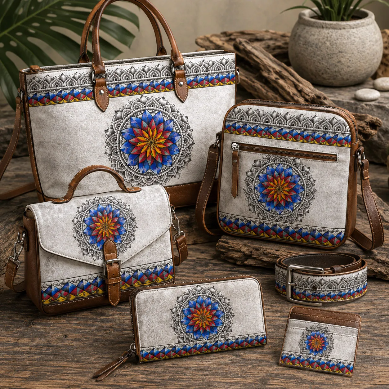
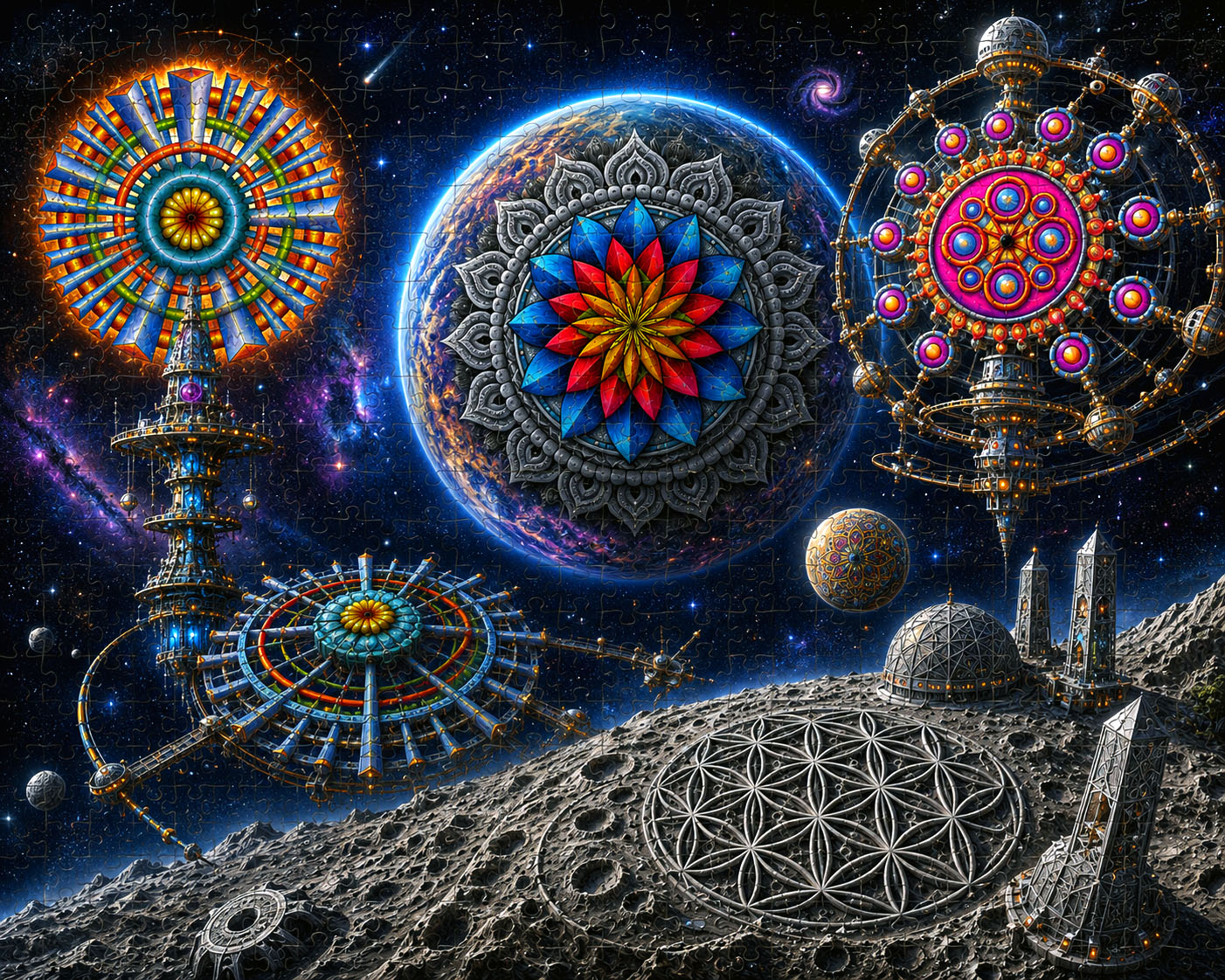
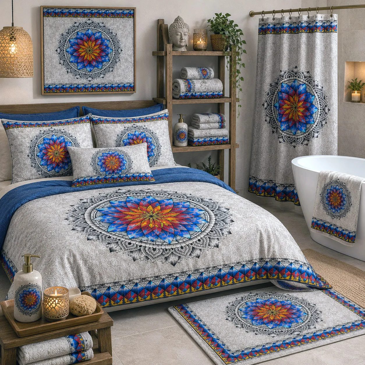
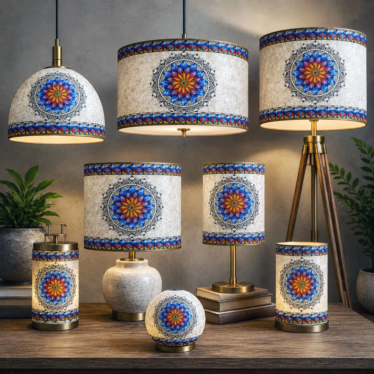
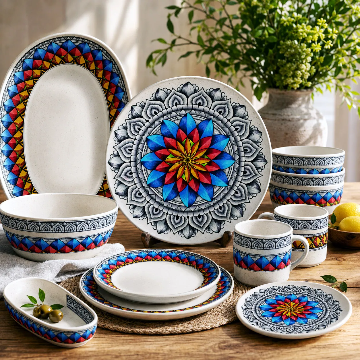
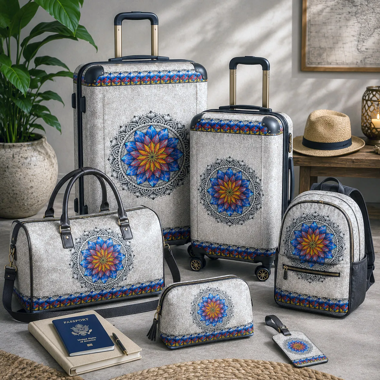
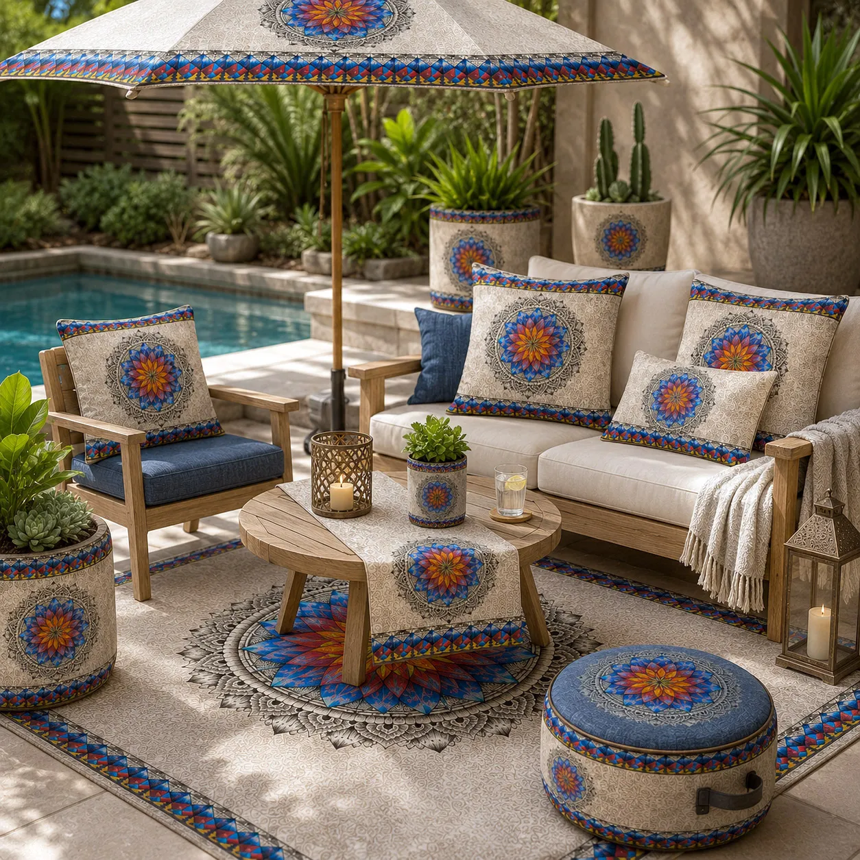
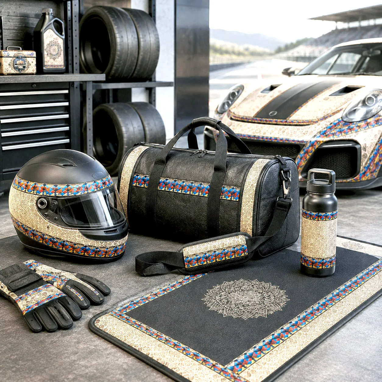
A modular design that can generate multiple product applications and pattern variations.
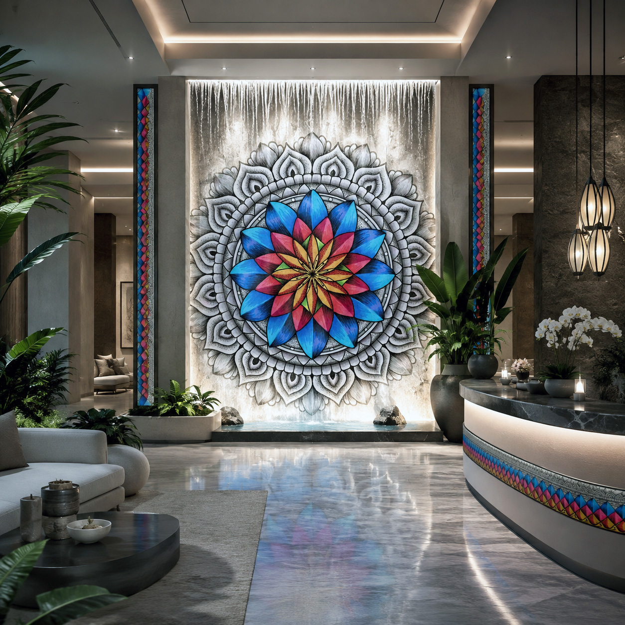
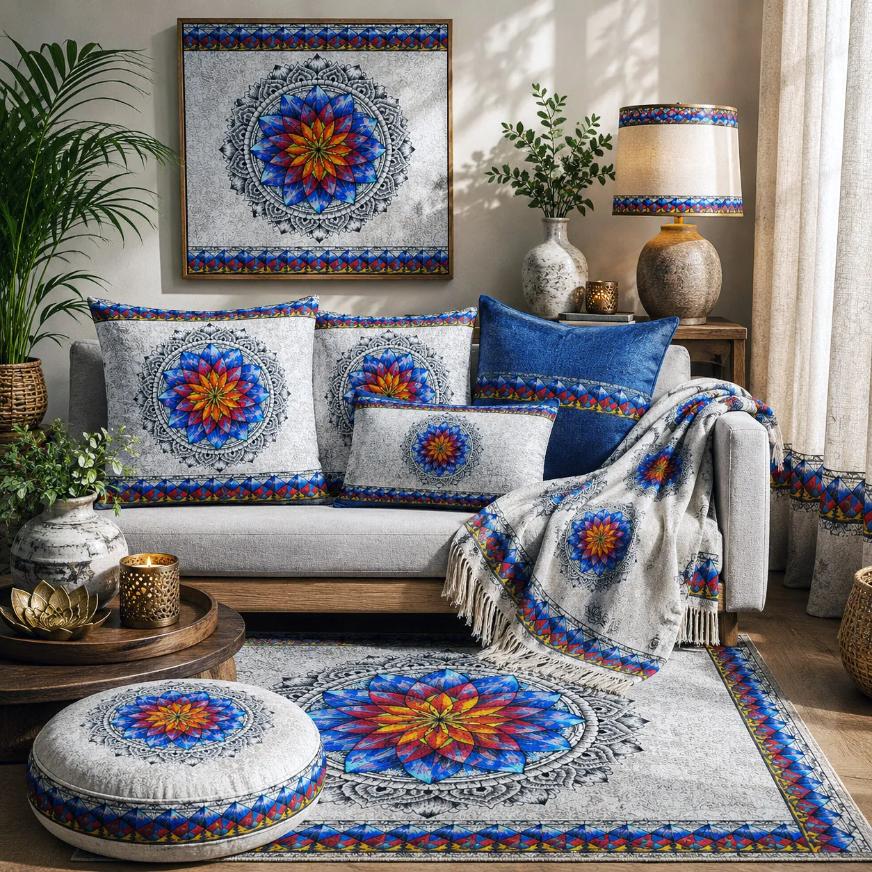
Beyond licensed products, this design system can define entire retail, hospitality, wellness, and commercial interiors through coordinated architectural graphics, fixtures, lighting, wayfinding, and branded environments.
Examples of how this design system translates across product categories and materials.