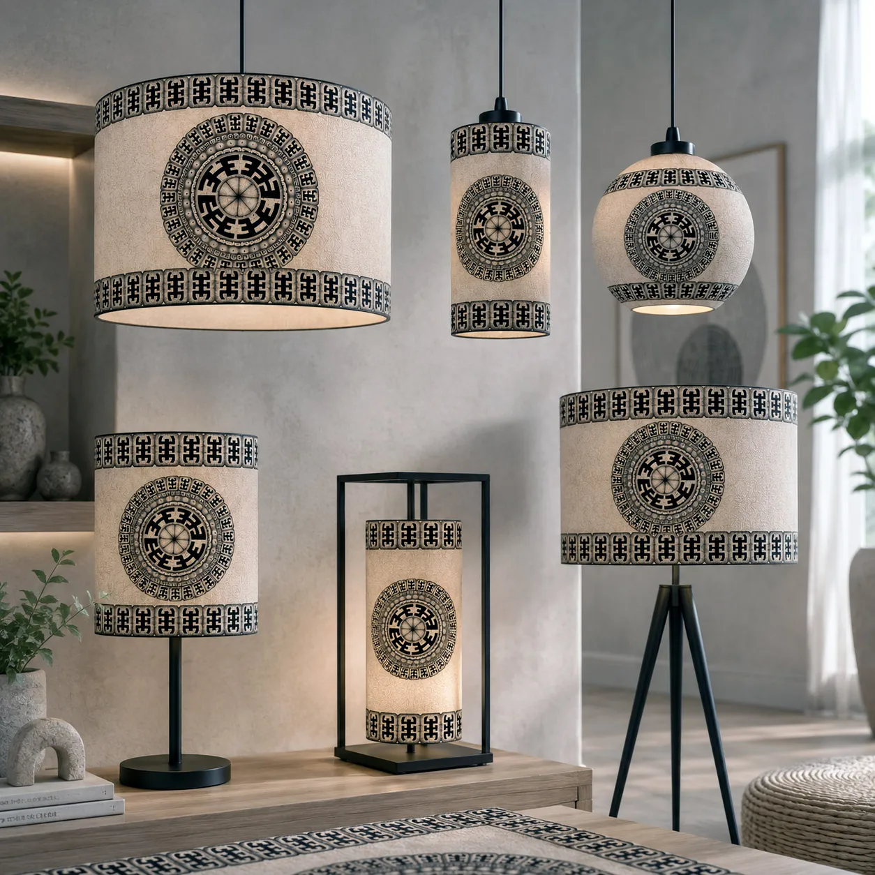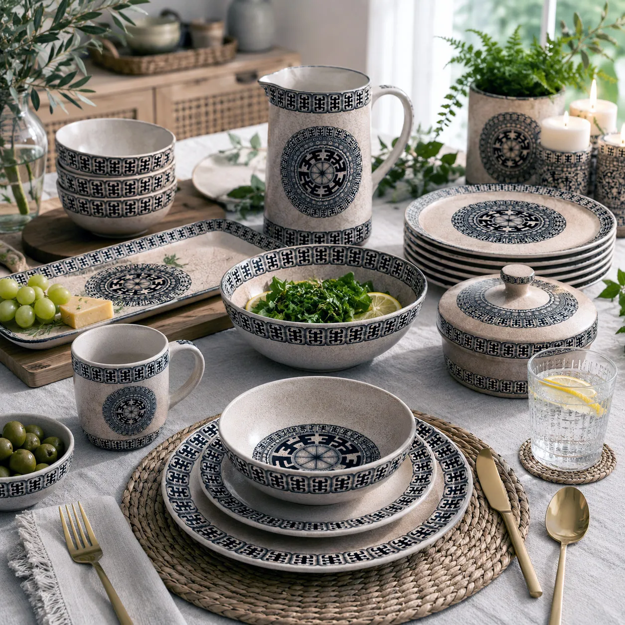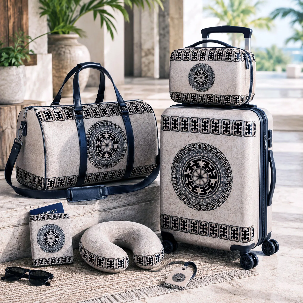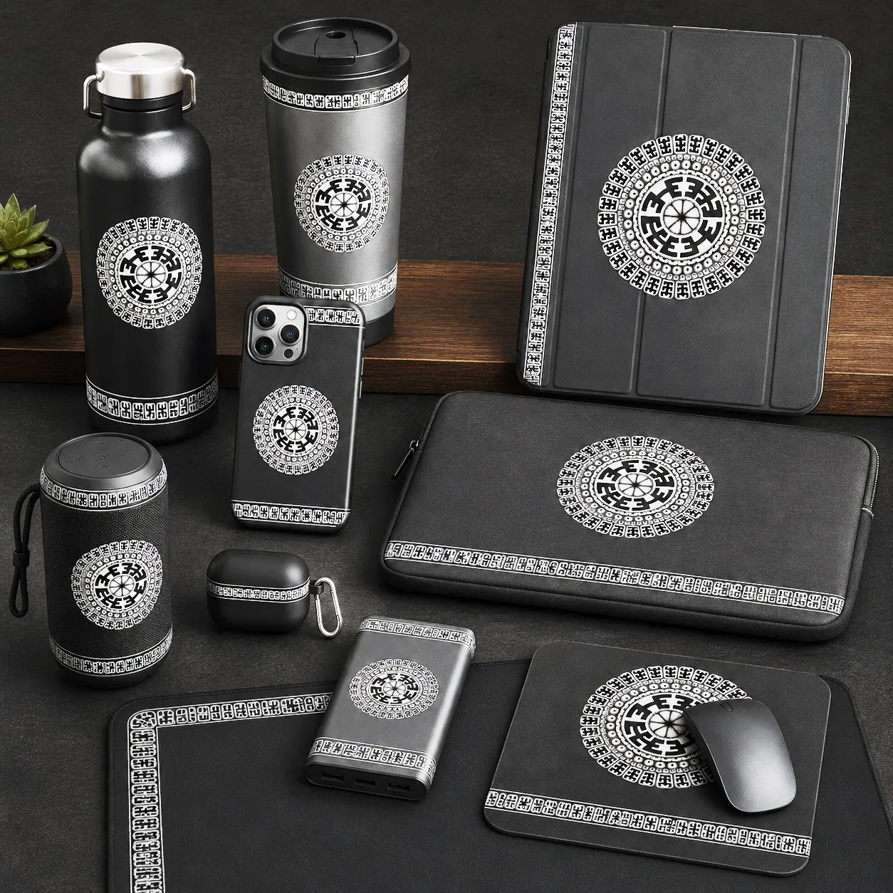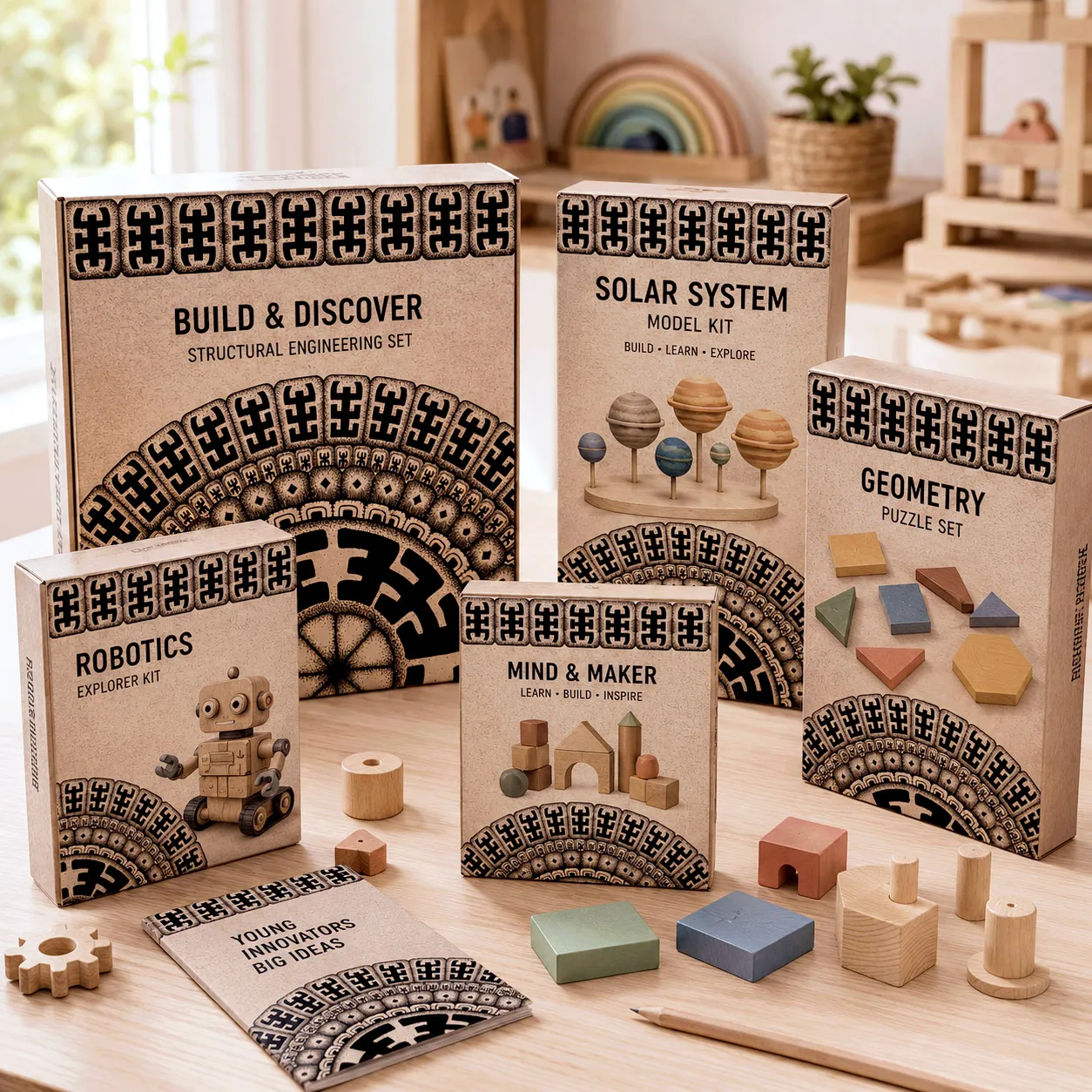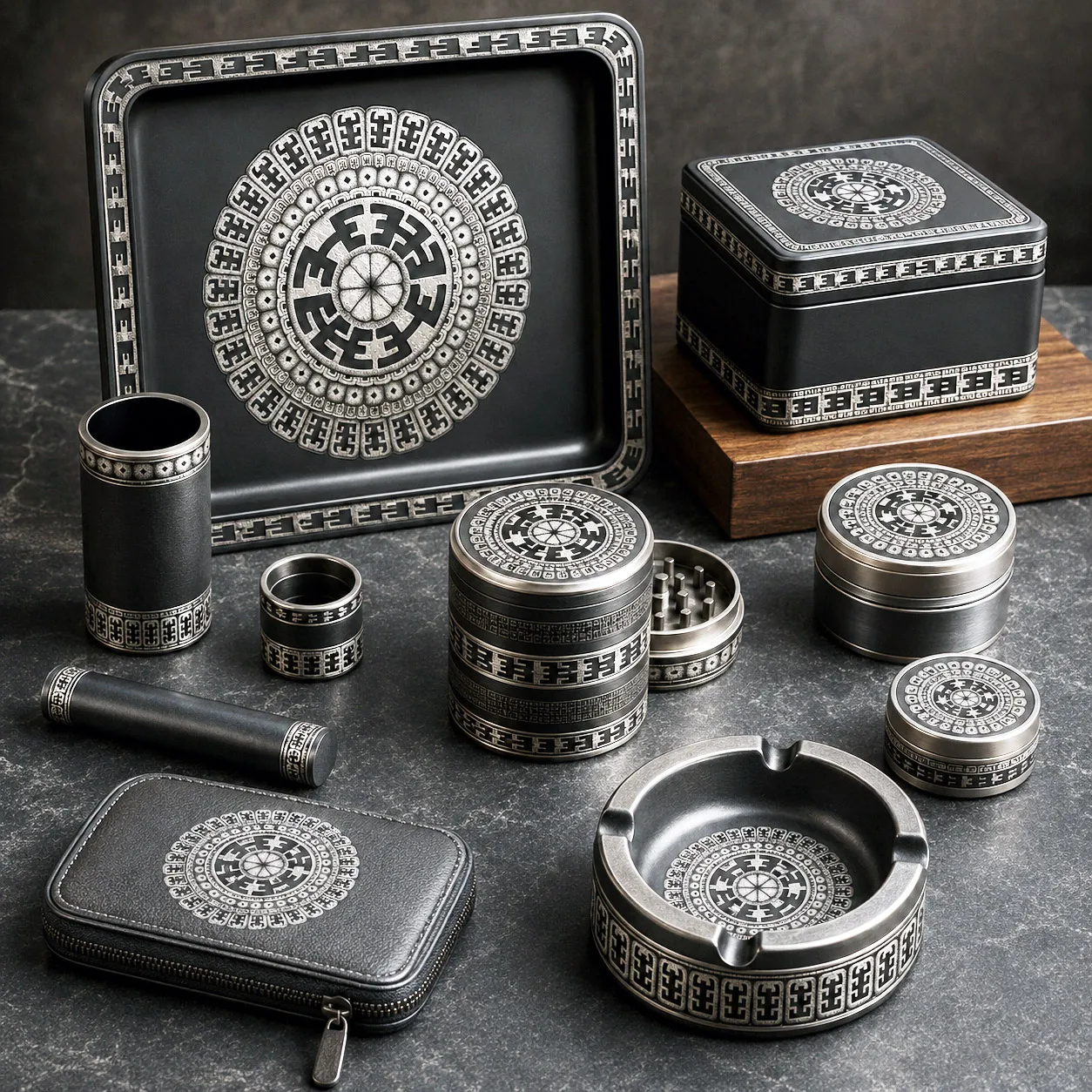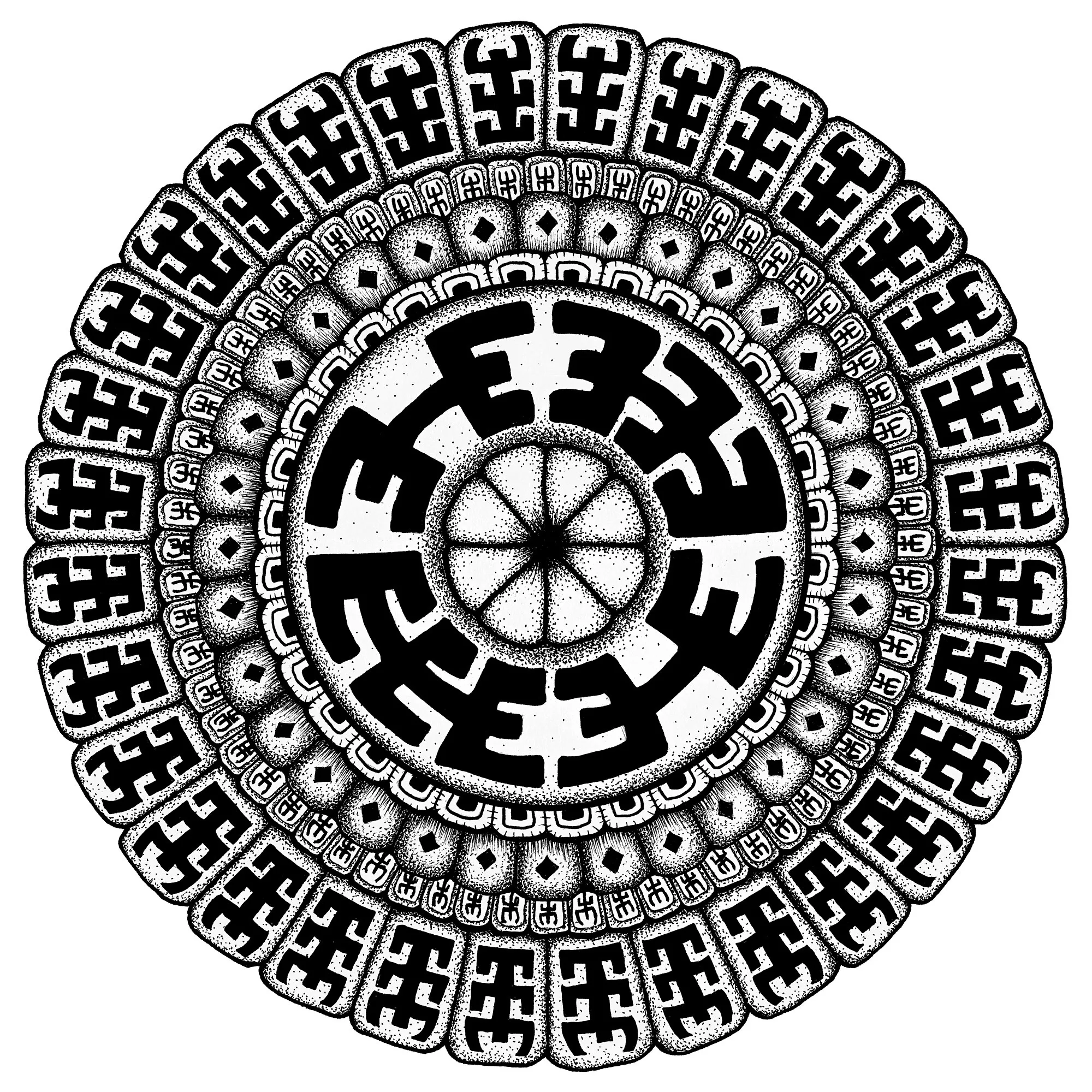




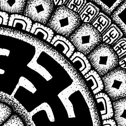
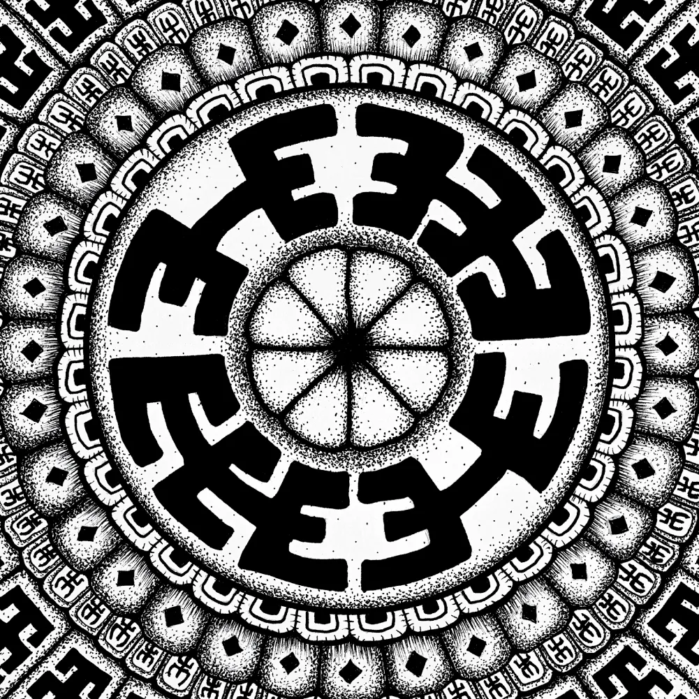
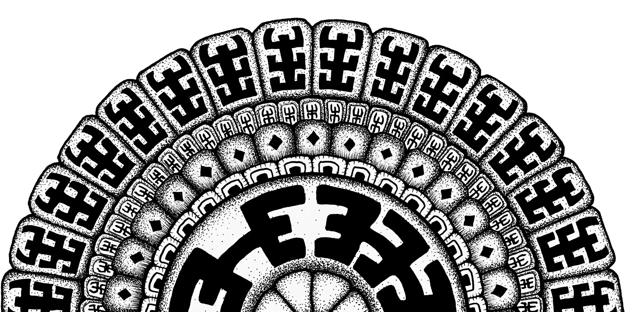
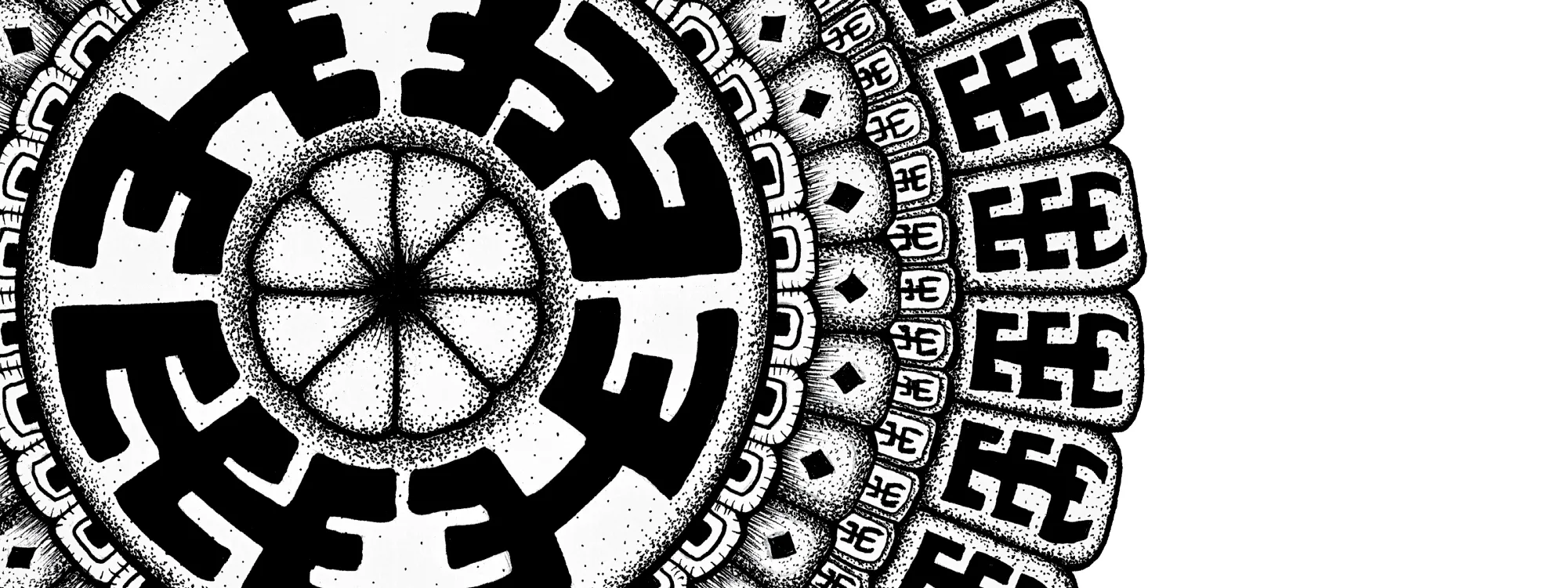
Komo is a disciplined geometric design system defined by powerful black forms, rhythmic repetition, and architectural symmetry. Built from interlocking radial motifs, the structure creates a commanding visual presence while maintaining precise balance.
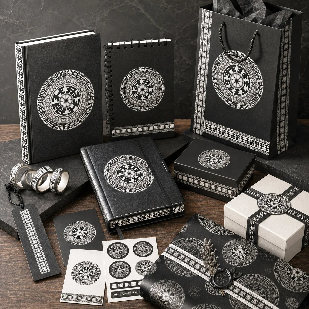
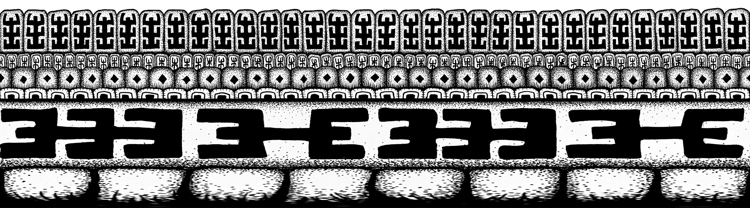
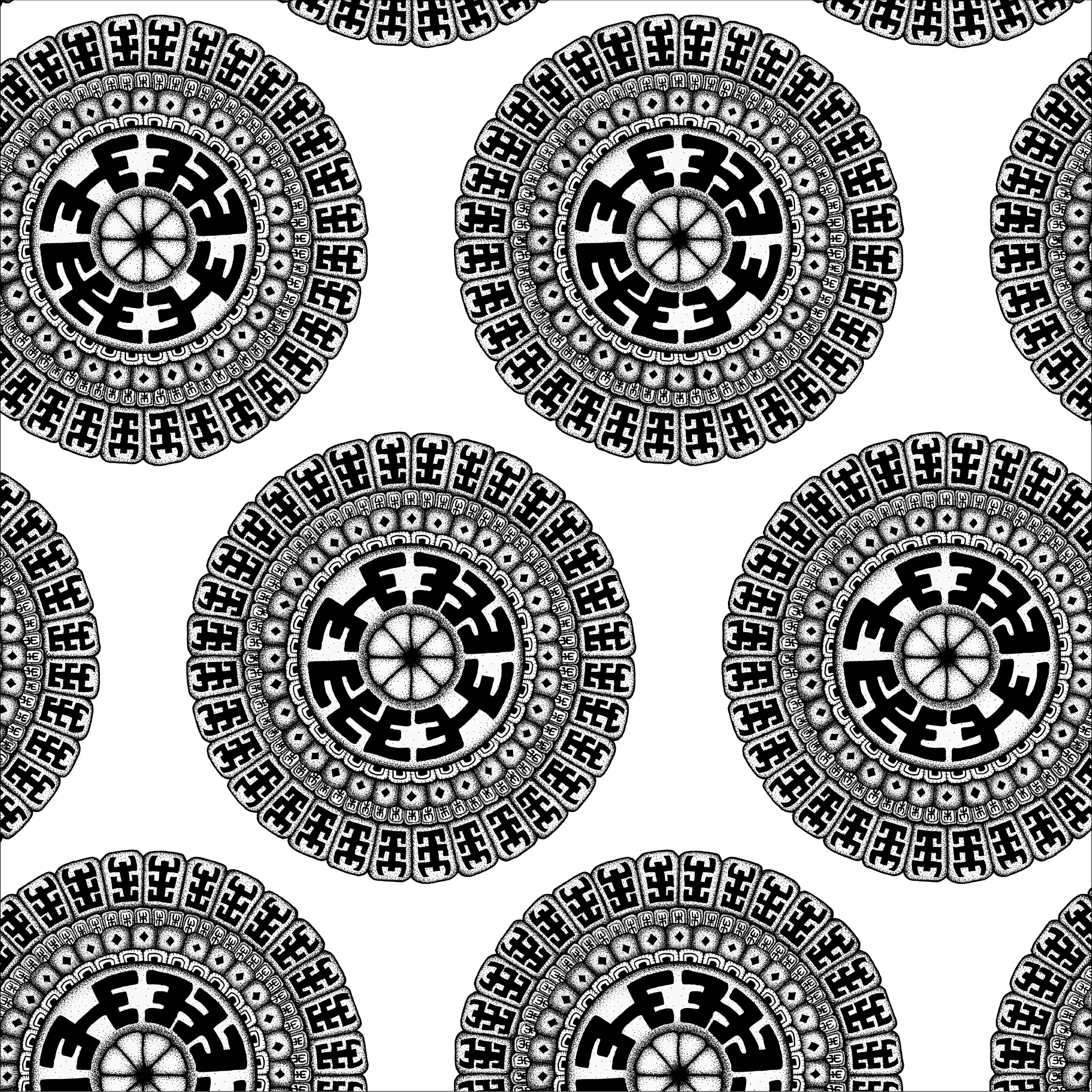
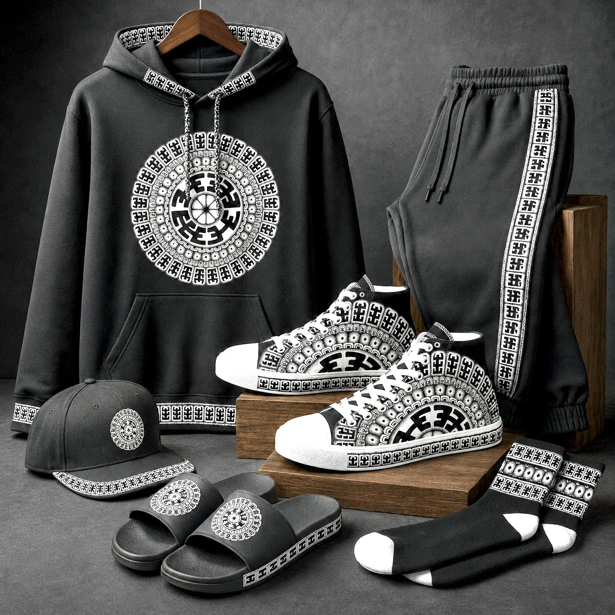
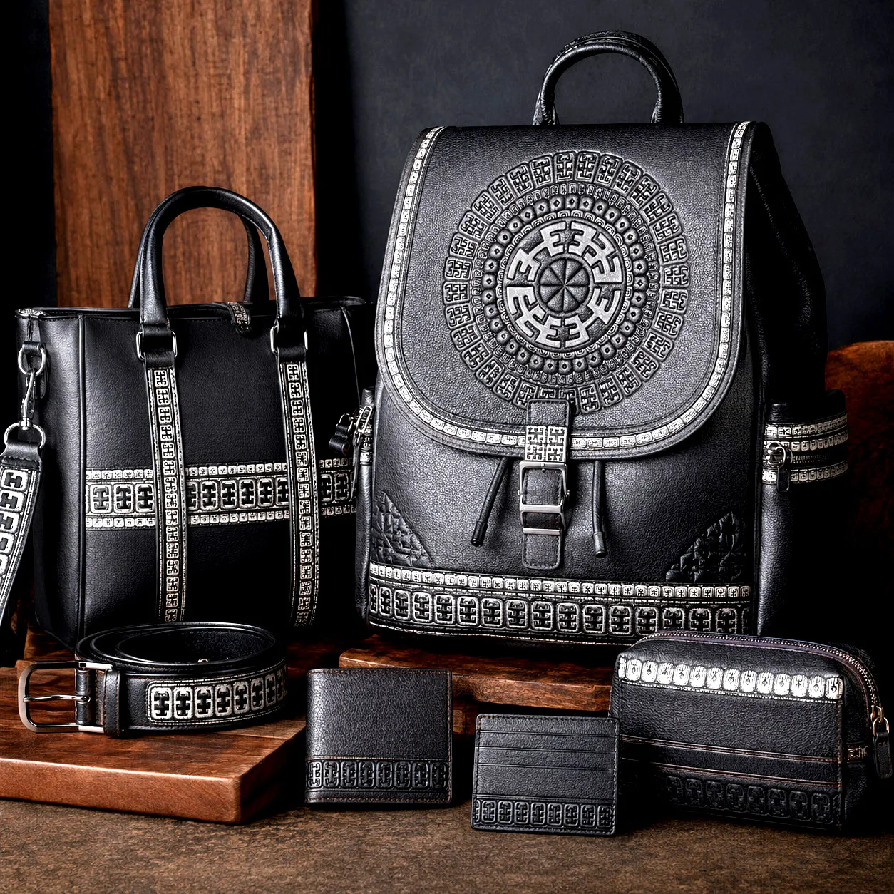
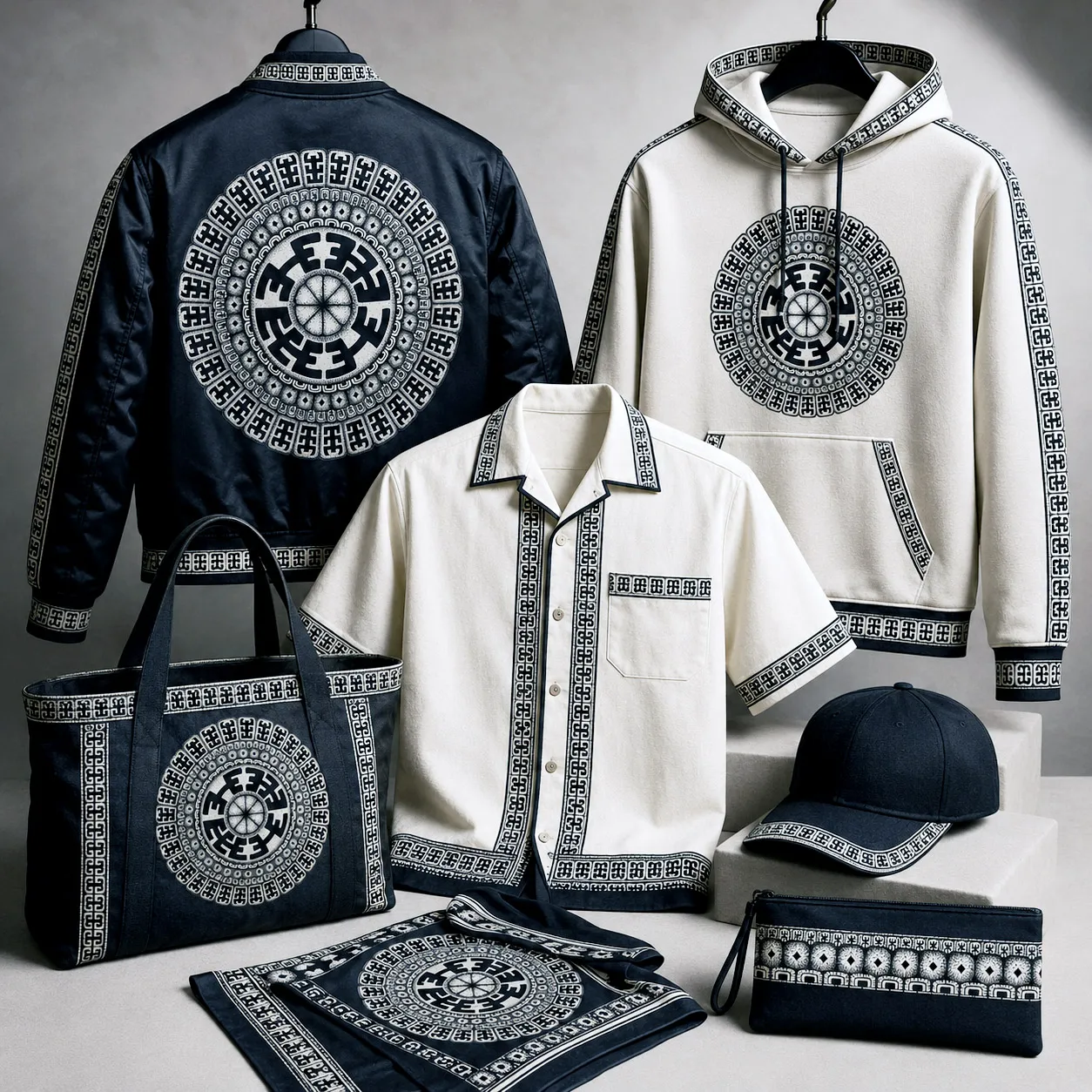
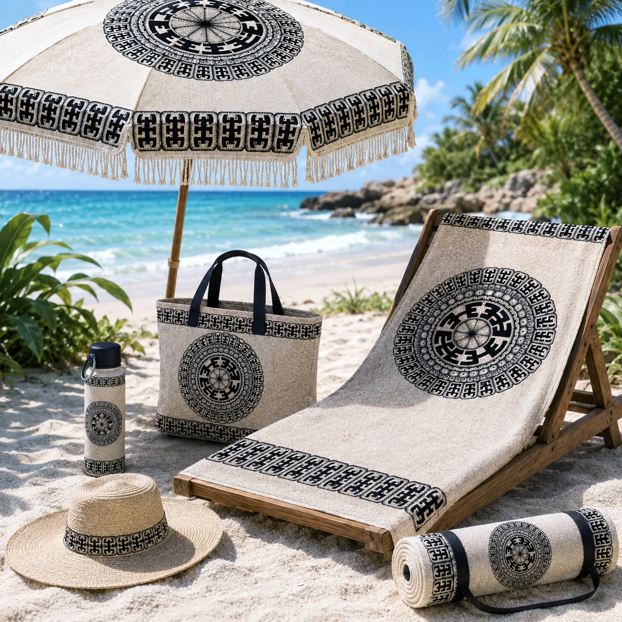
The heavy contrast and graphic clarity allow the system to perform exceptionally well across product categories — from footwear panels and apparel placements to seamless textile repeats and hard goods applications. Individual elements can be isolated, mirrored, or extended into pattern systems without losing structural integrity.
Designed in monochrome for maximum versatility, Komo adapts easily to brand colorways while preserving its bold identity. Its strength lies in repetition — a visual language that is confident, grounded, and scalable.
Komo is built for brands that want geometry with presence — not decoration, but impact.
A modular design that can generate multiple product applications and pattern variations.
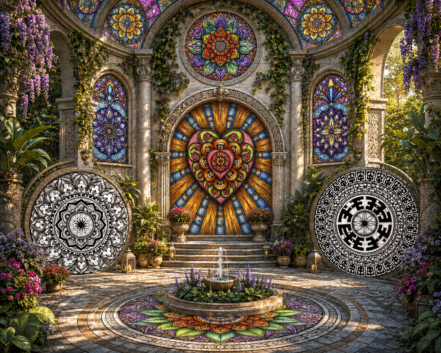
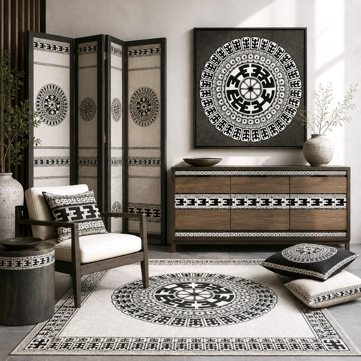
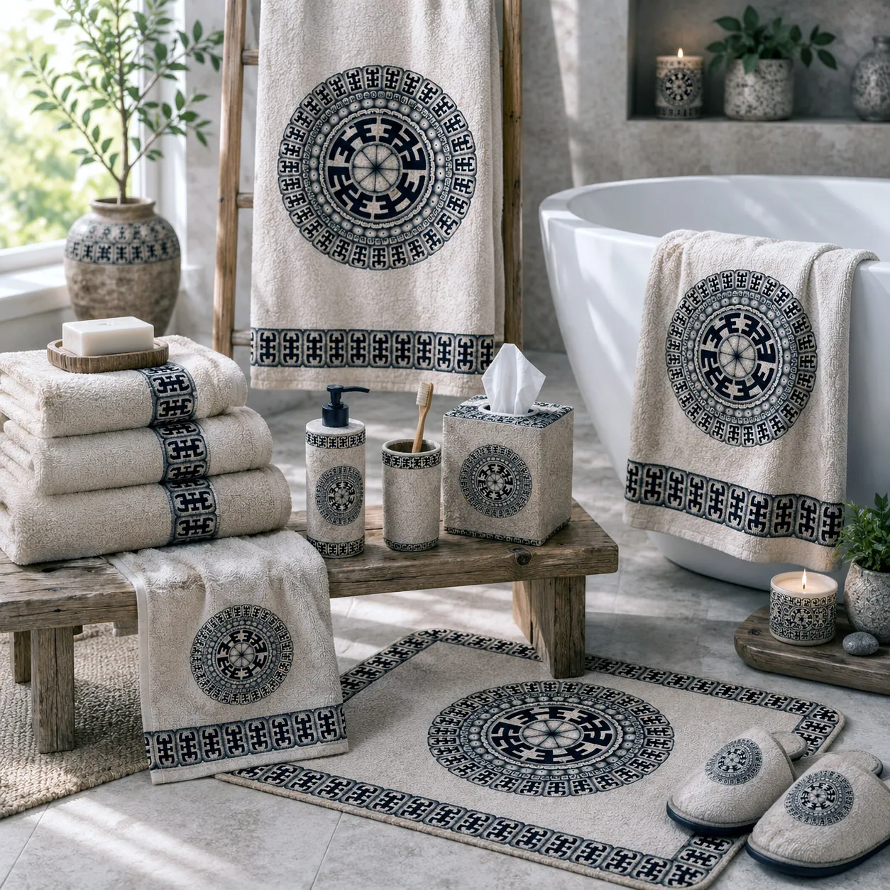
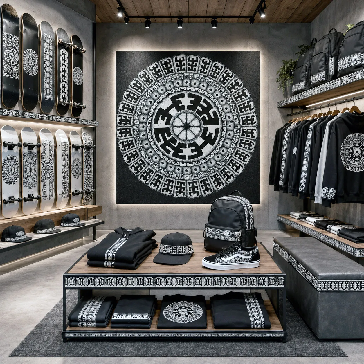
Beyond licensed products, this design system can define entire retail, hospitality, wellness, and commercial interiors through coordinated architectural graphics, fixtures, lighting, wayfinding, and branded environments.
Examples of how this design system translates across product categories and materials.

.webp)