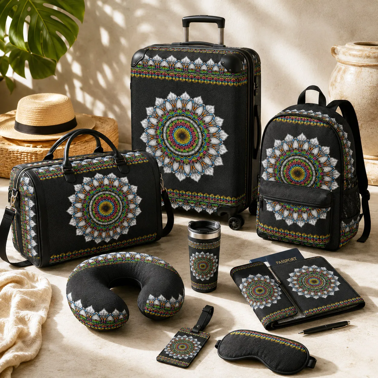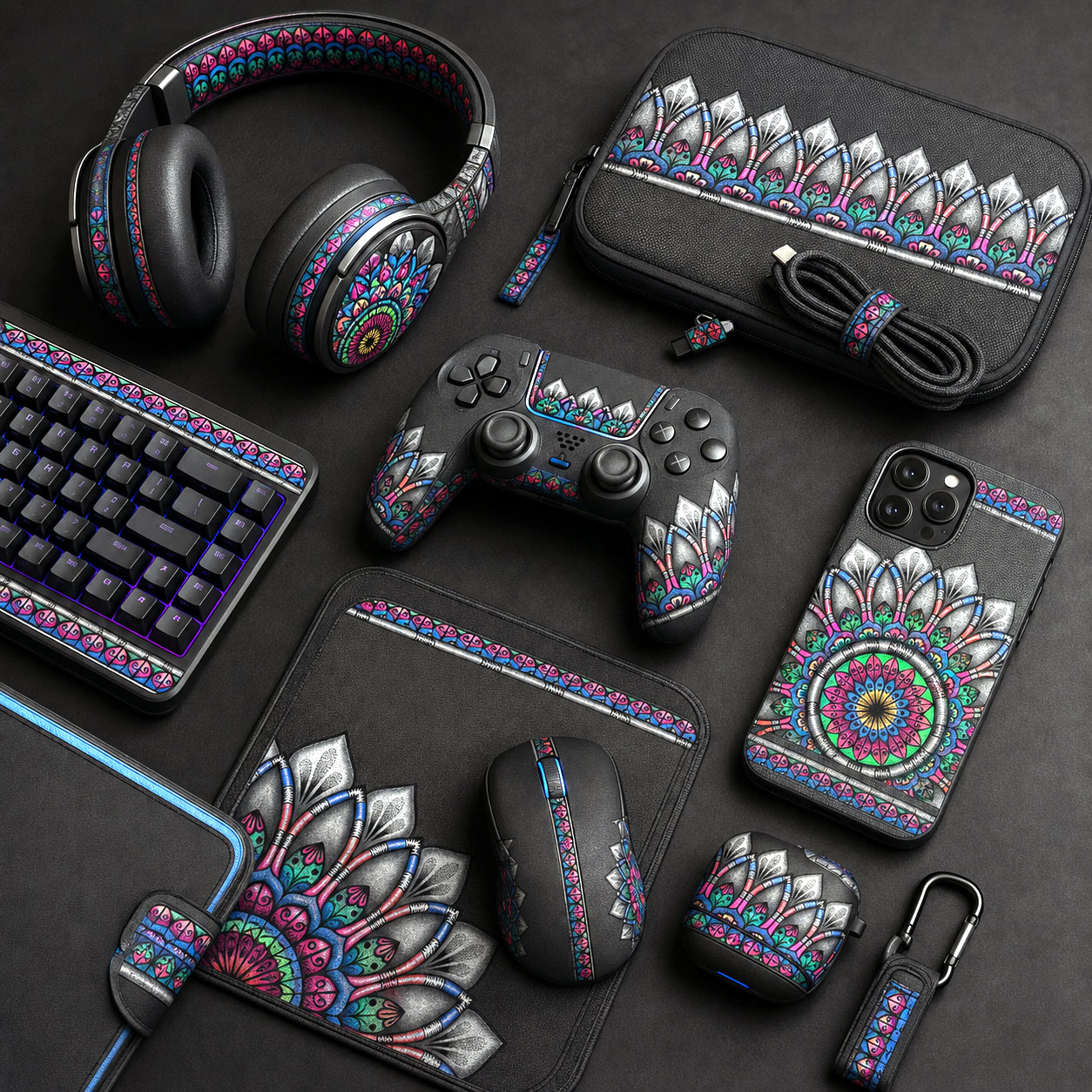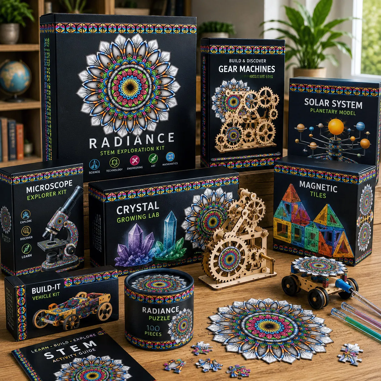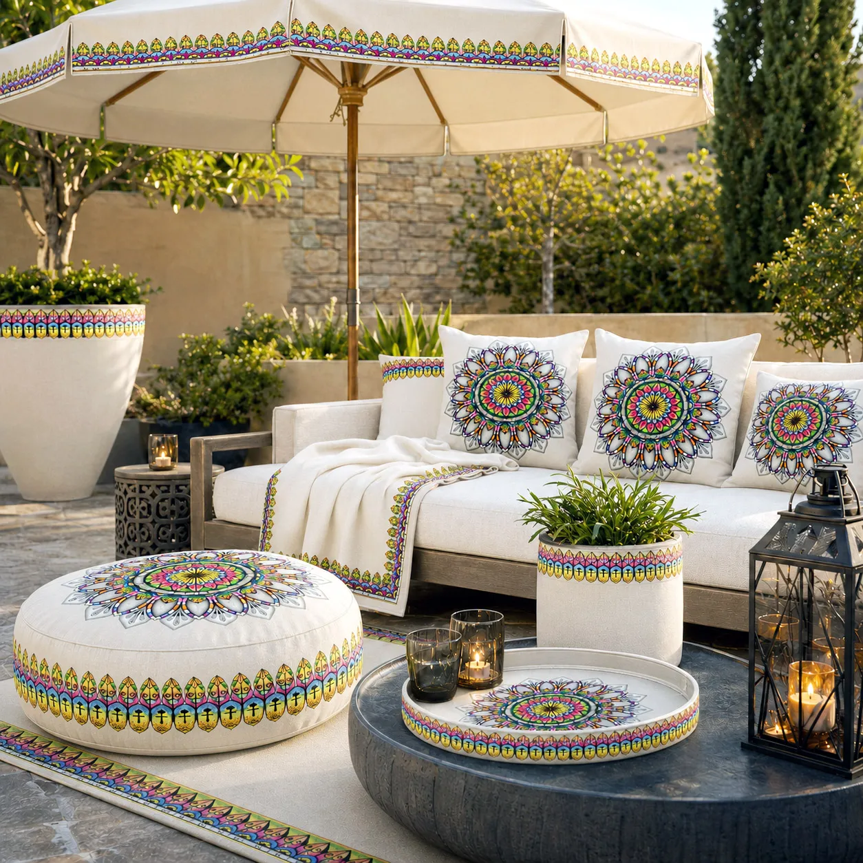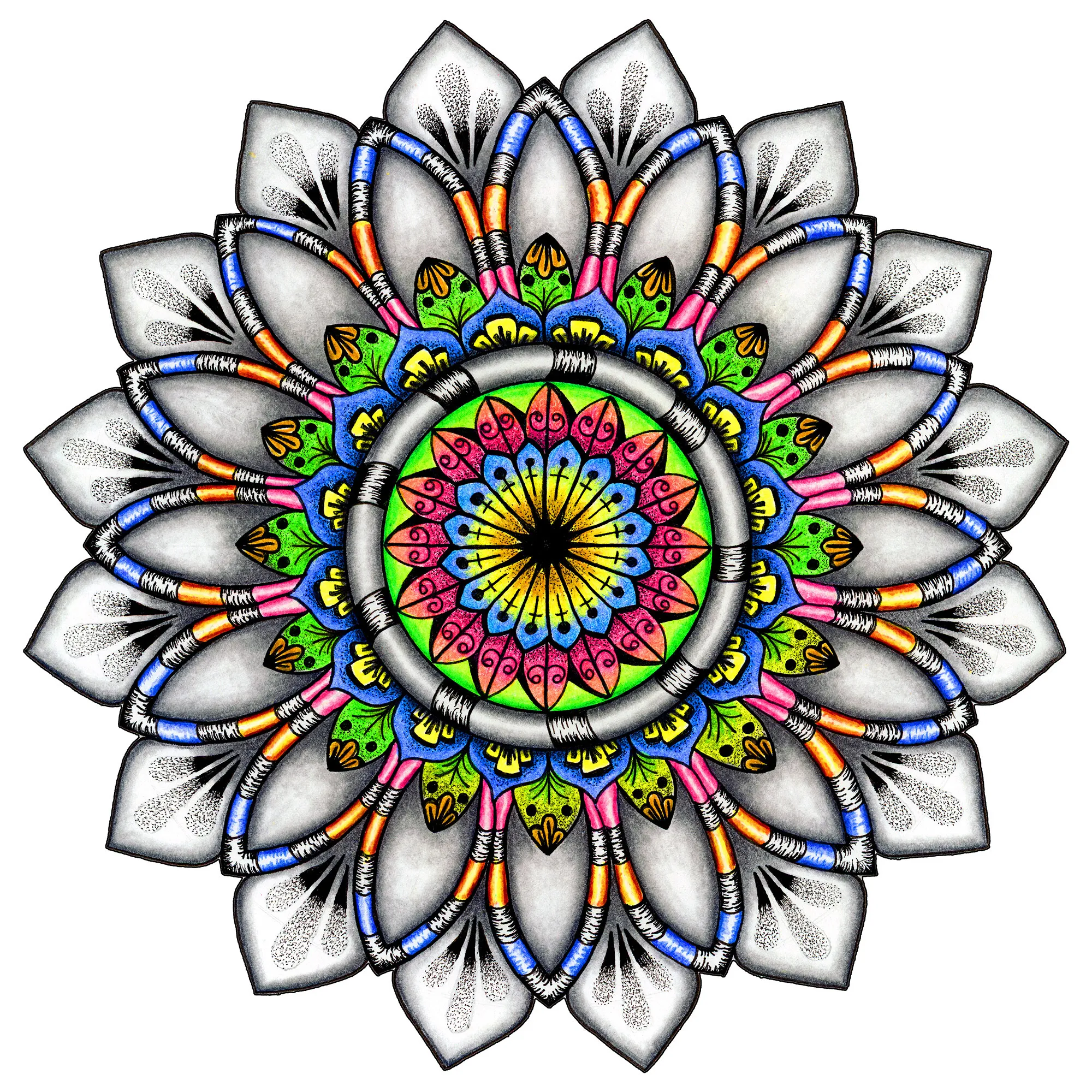


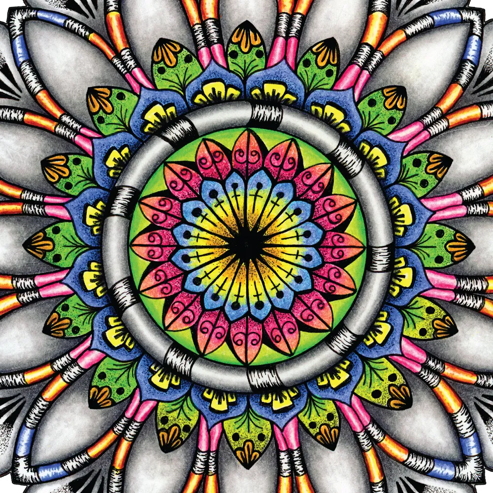
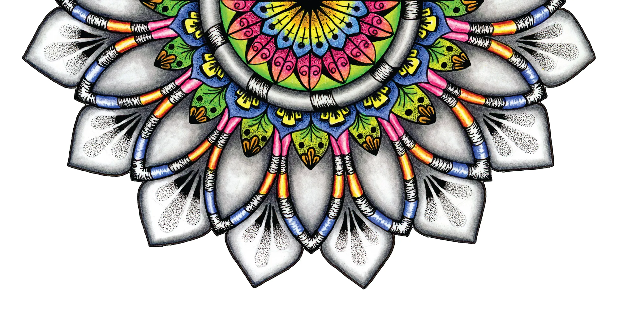
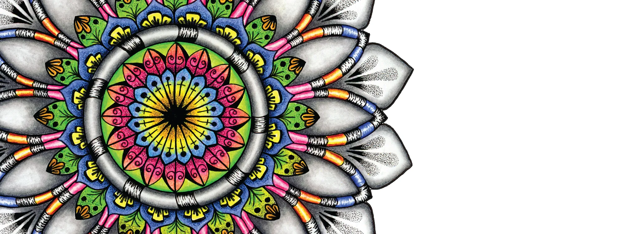
Radiance is a design system built around the idea of controlled illumination—where energy doesn’t explode outward, but instead expands with precision and grace. The composition is anchored by a bright, intricate core, surrounded by layered geometry that gradually softens as it moves outward.
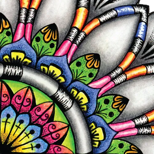
The inner structure is rich with color and detail, drawing the eye inward with a sense of focus and intensity. This central energy is framed by a series of petal-like forms rendered in soft grayscale tones, creating a striking contrast between vibrancy and restraint. The result is a balanced tension between bold expression and quiet refinement.
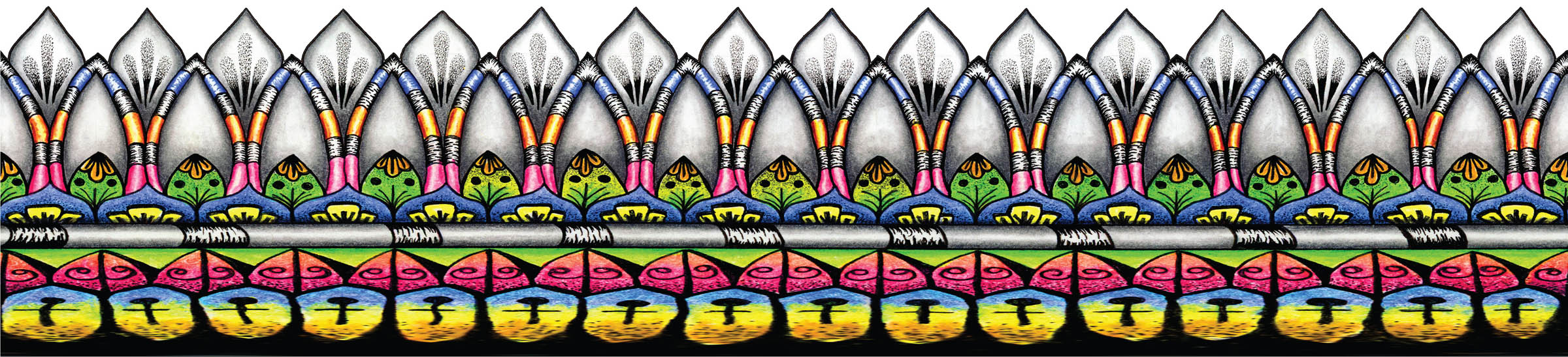
The outer layers introduce a rhythmic repetition that feels both organic and architectural, giving the design a sense of stability and elegance. Subtle texture within the petals adds depth without overwhelming the composition, allowing the central color to remain the focal point.
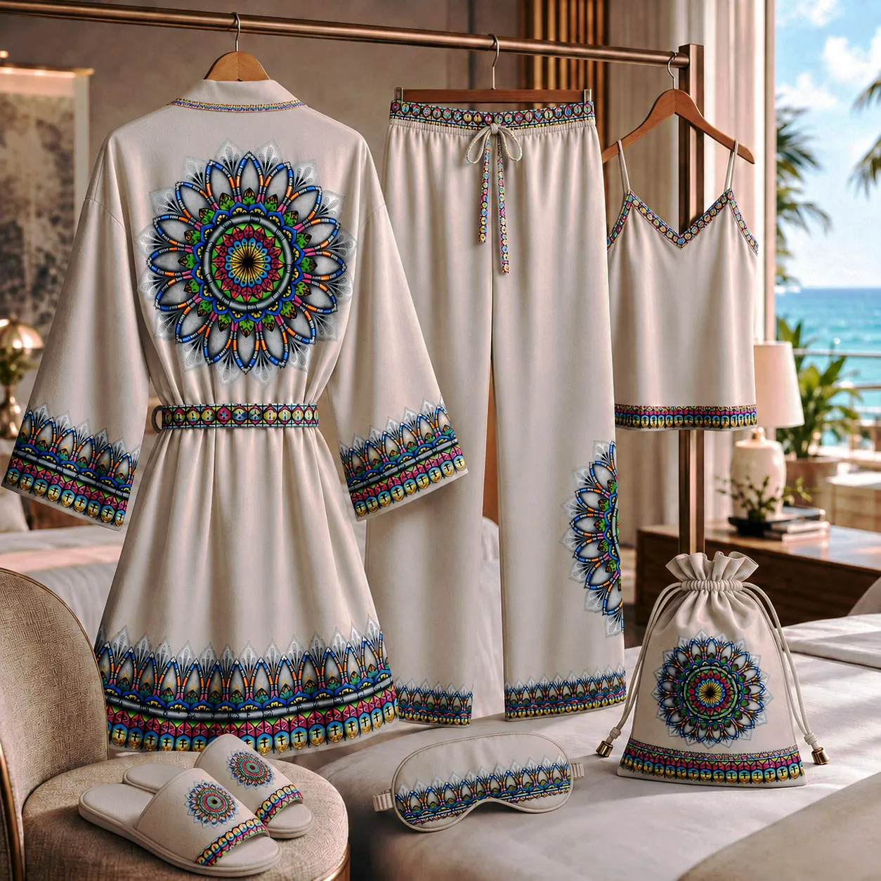
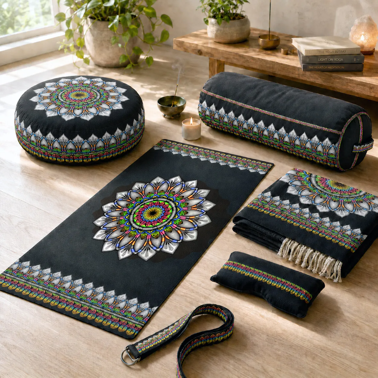
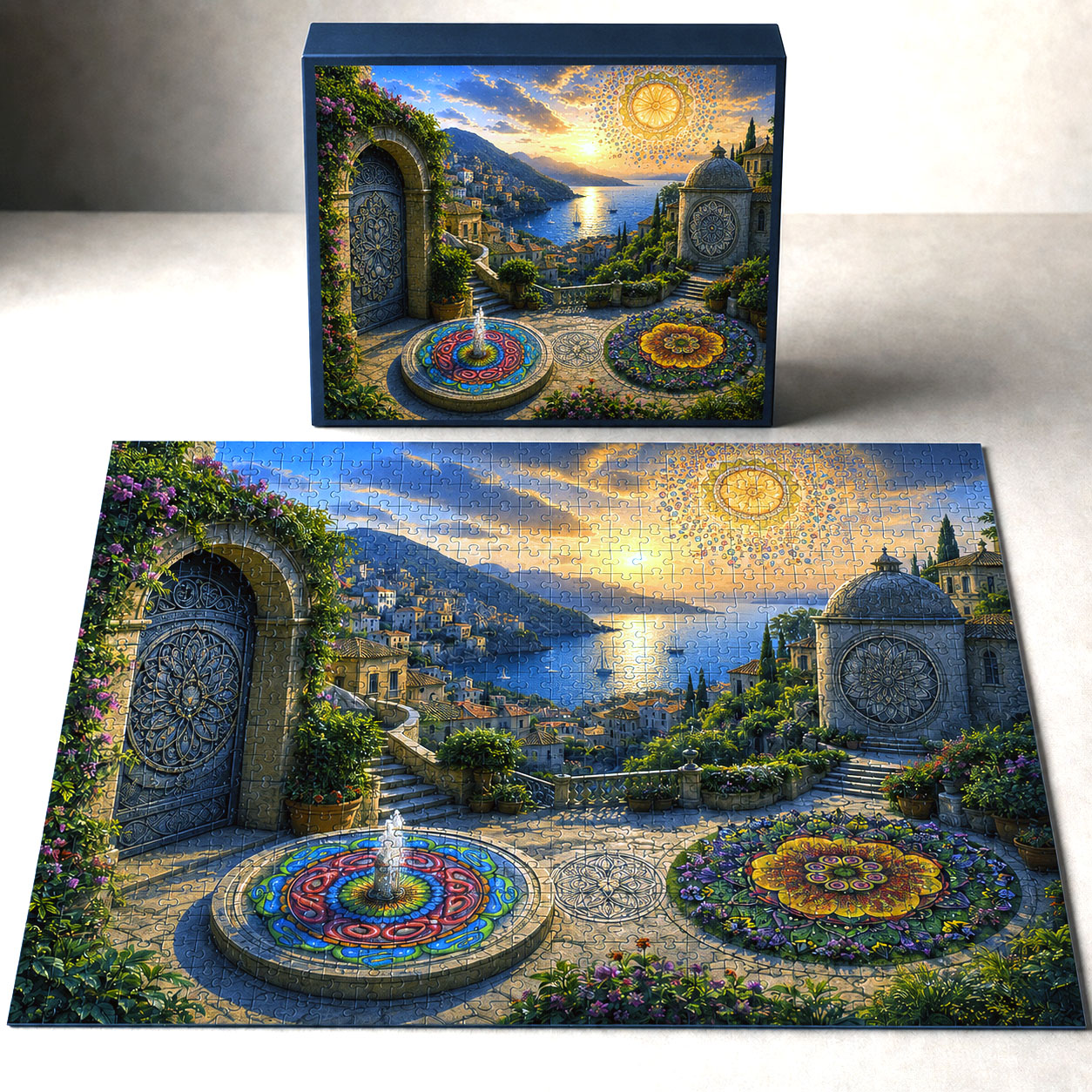
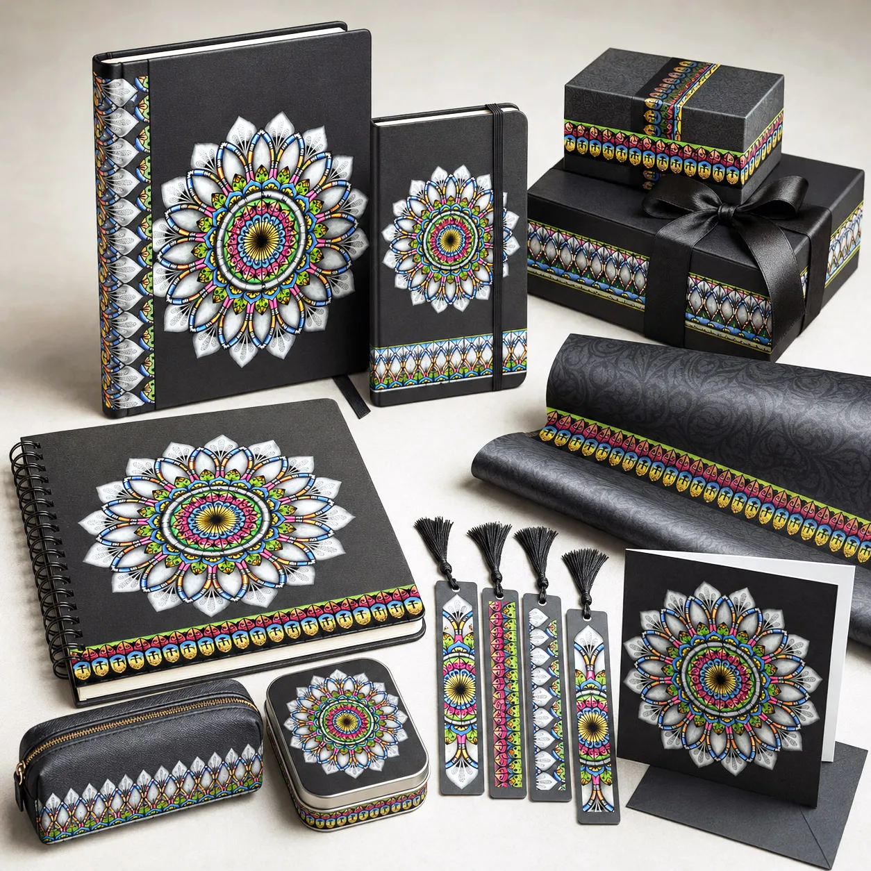
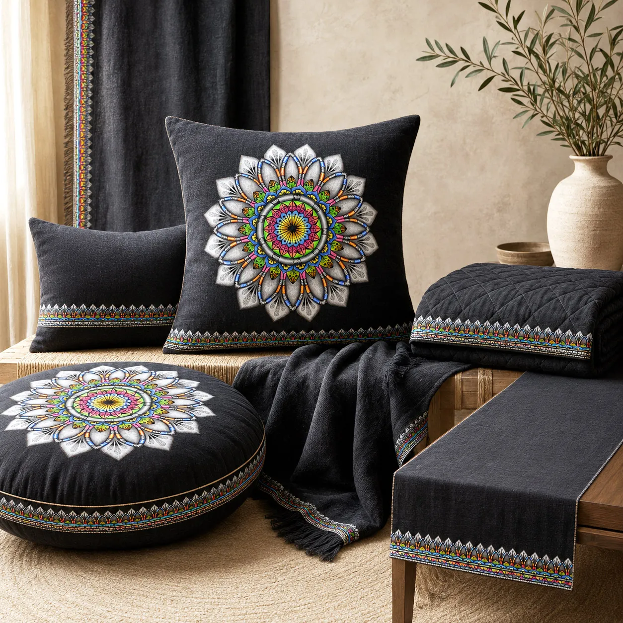
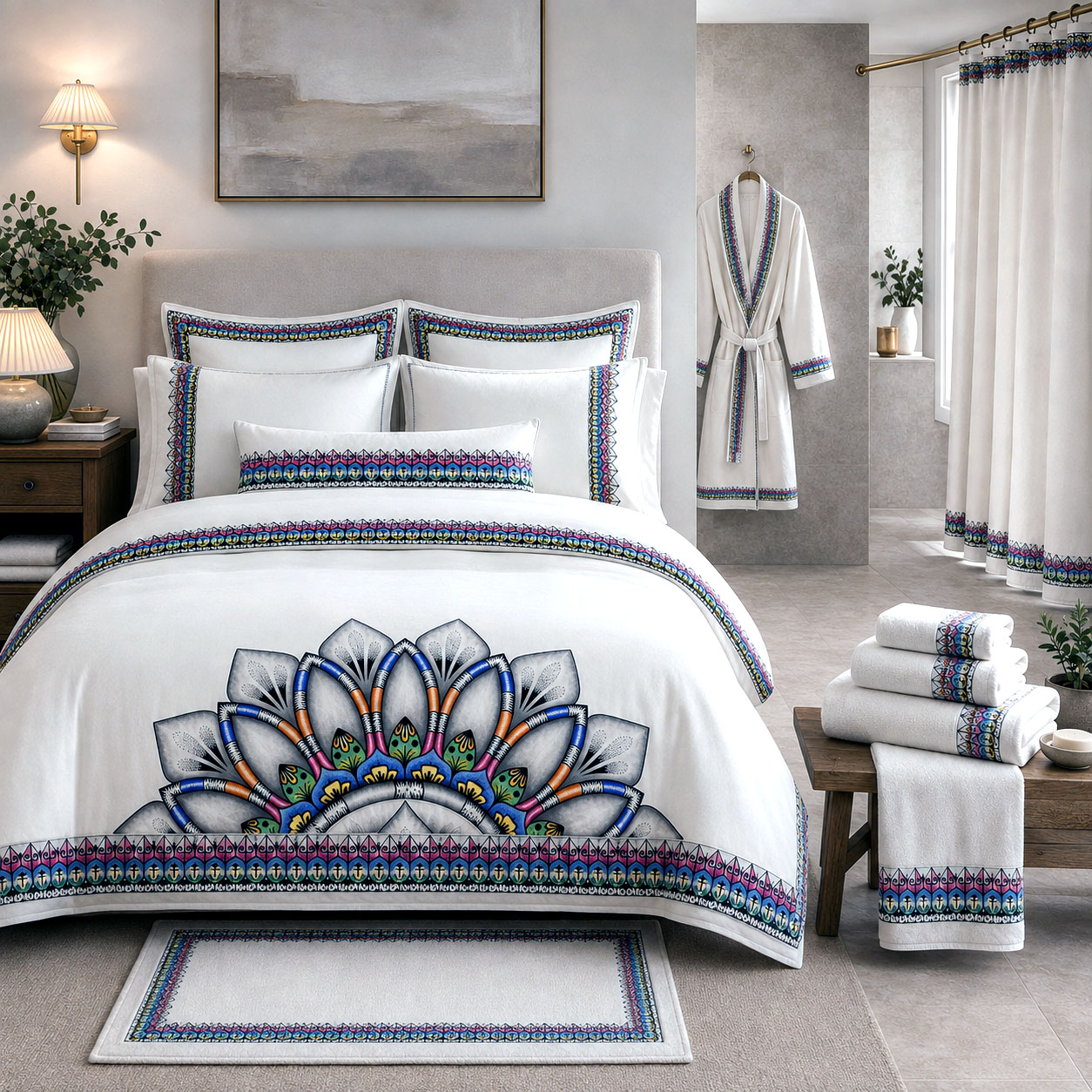
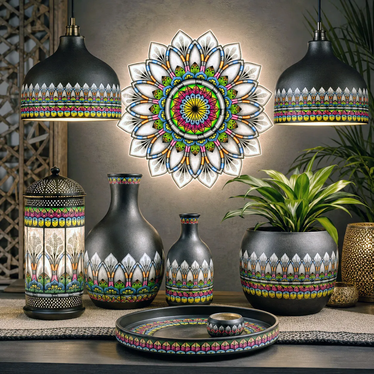
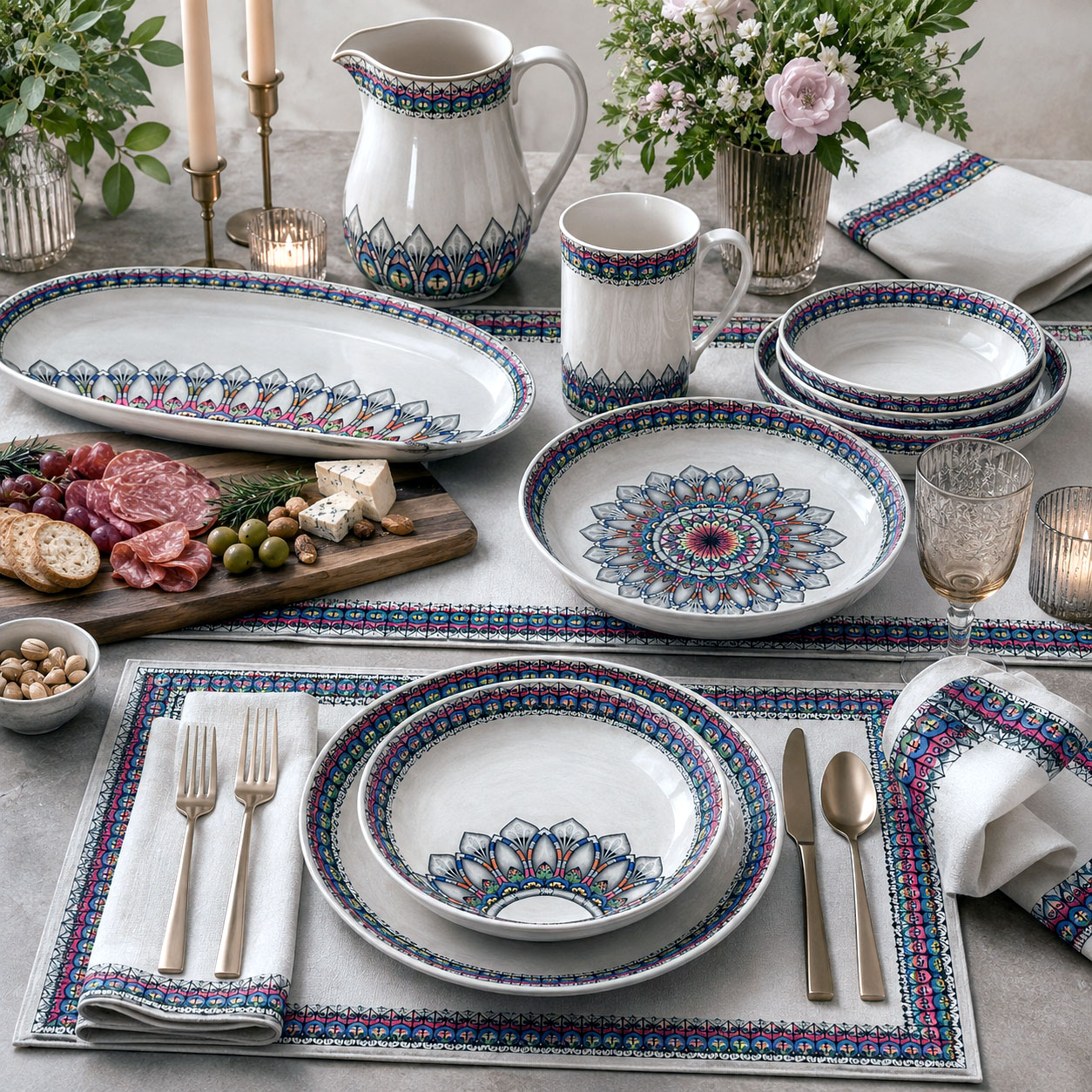
As a design system, Radiance offers strong versatility. The high-detail core can be used as a hero placement, while the outer petal structures lend themselves well to repeats, borders, and more minimal applications. The contrast between neutral and color-rich elements makes it especially effective across different materials and finishes—from soft goods and print to etched or backlit fabrication.
Overall, the design communicates clarity, harmony, and elevated energy—making it well-suited for brands seeking a visual identity that feels both vibrant and sophisticated.
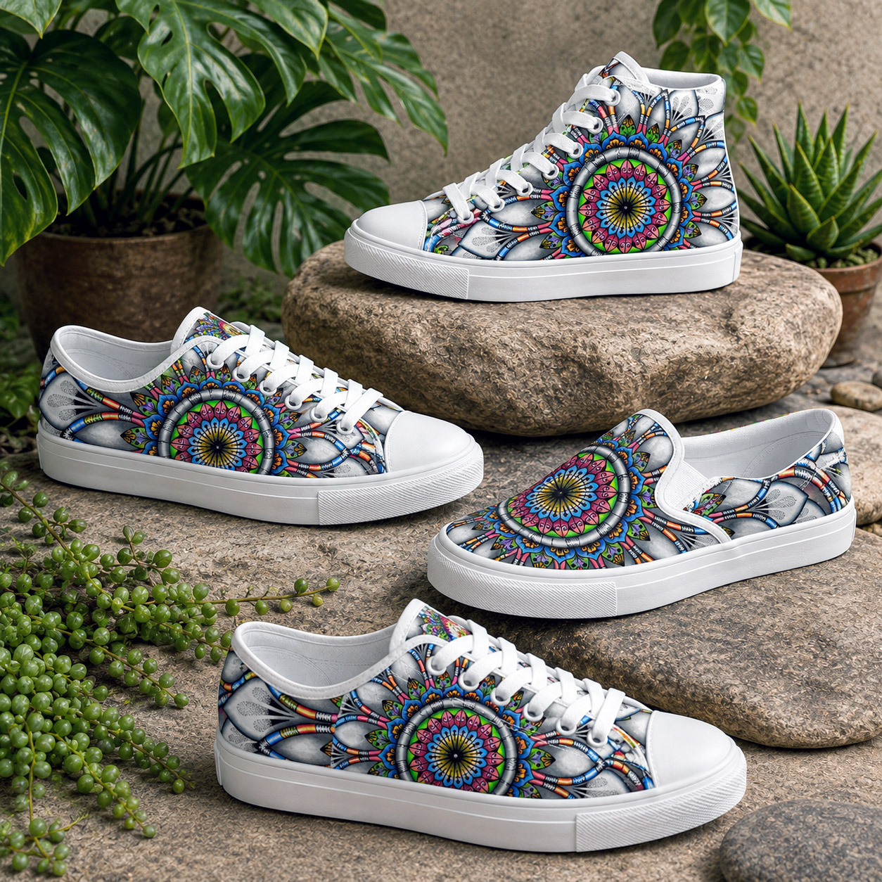
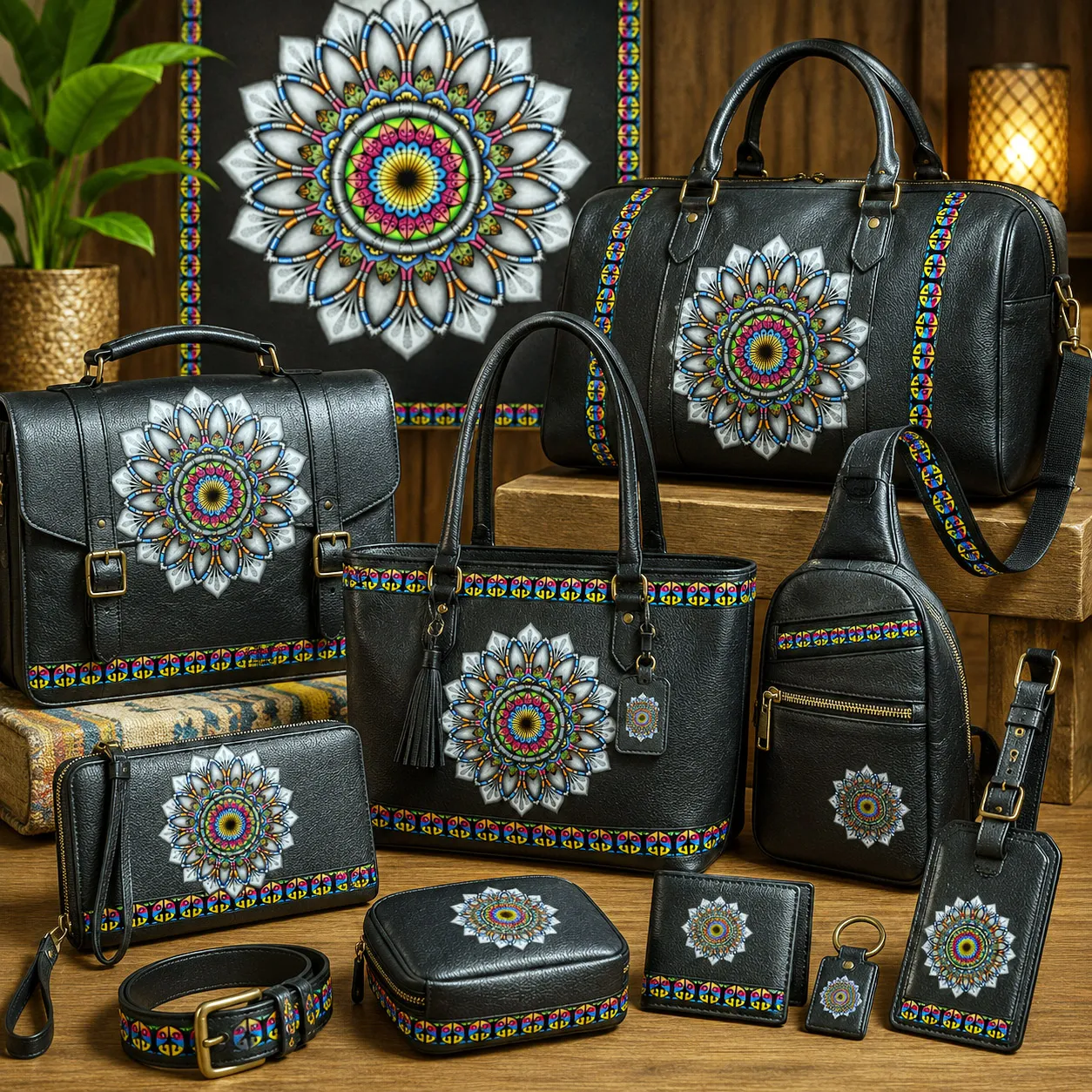
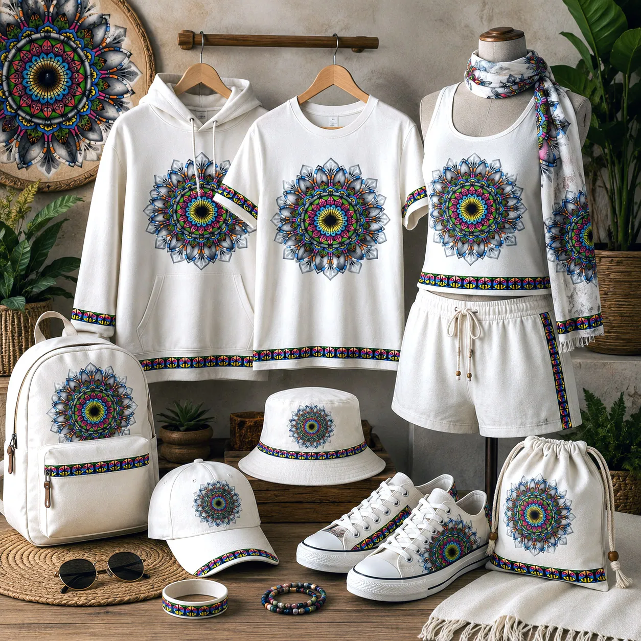
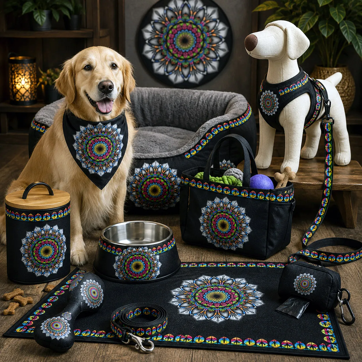
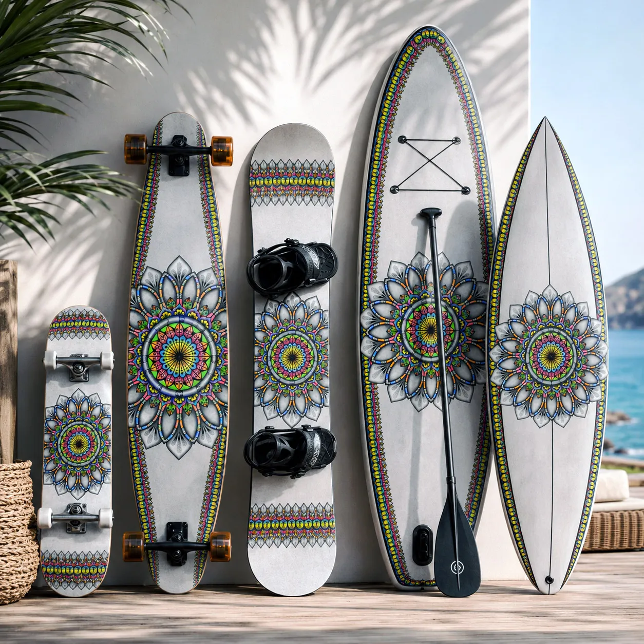
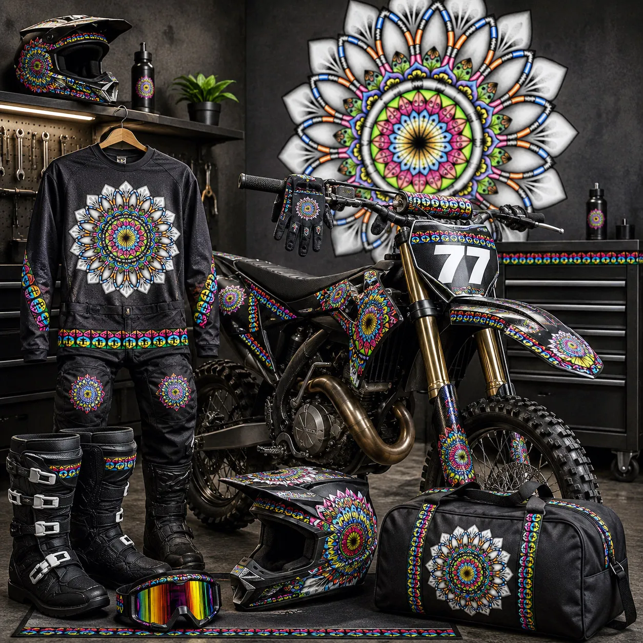
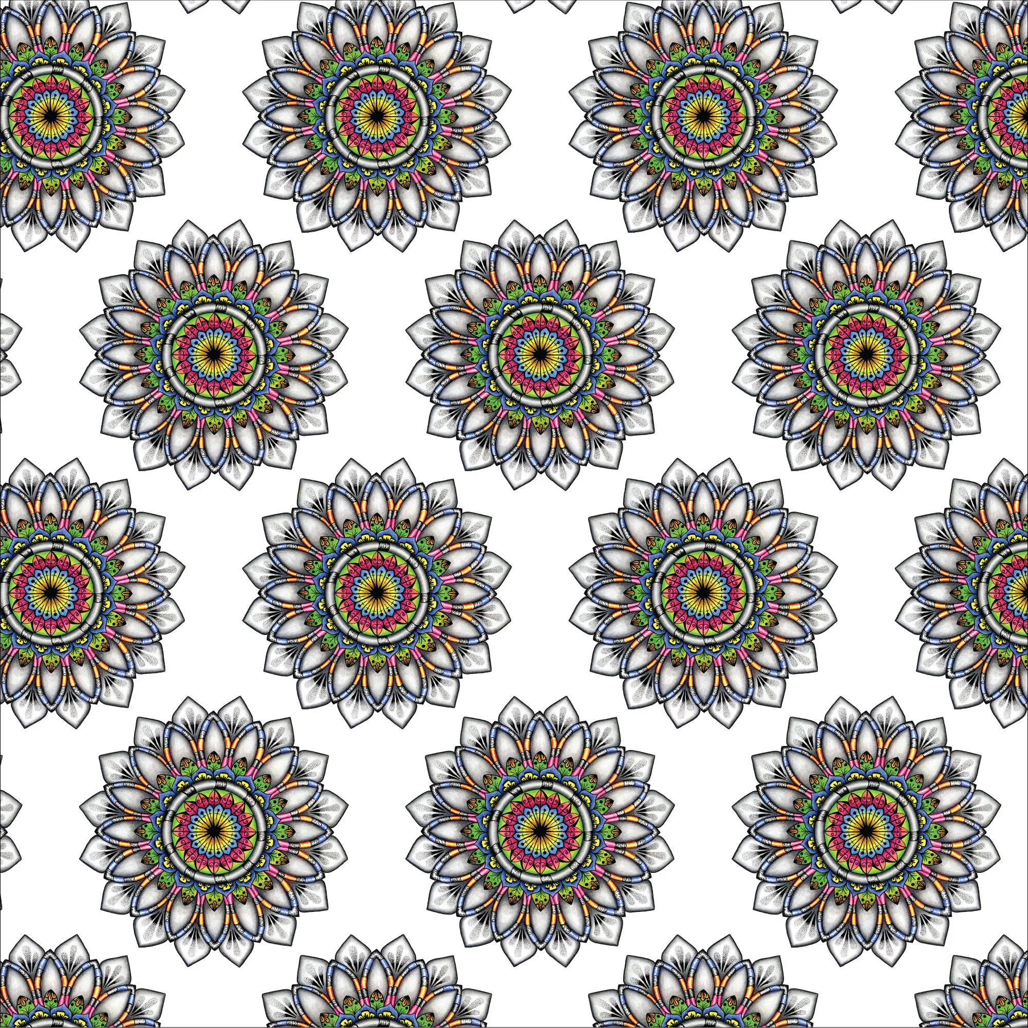
A modular design that can generate multiple product applications and pattern variations.
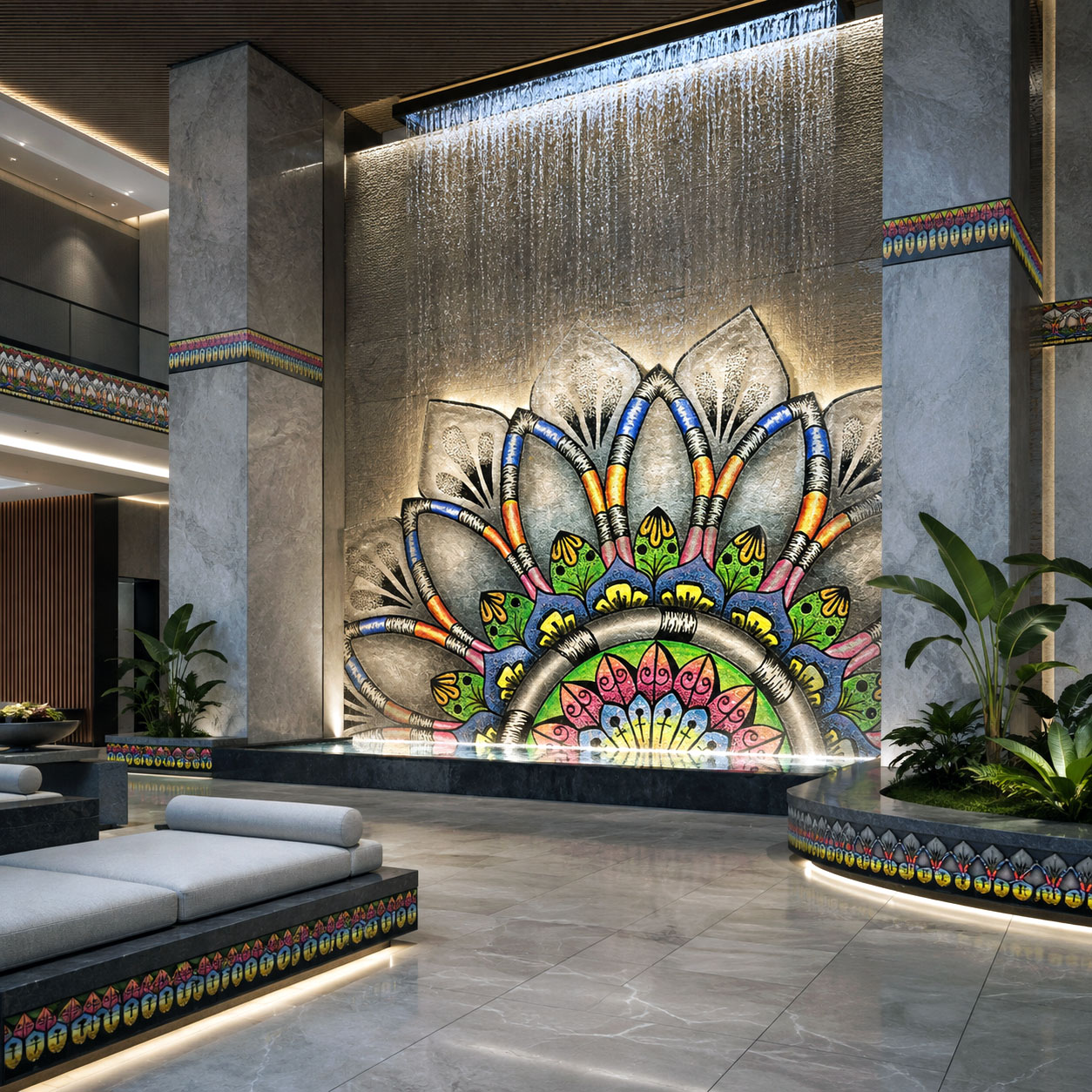
Beyond licensed products, this design system can define entire retail, hospitality, wellness, and commercial interiors through coordinated architectural graphics, fixtures, lighting, wayfinding, and branded environments.
Examples of how this design system translates across product categories and materials.